4 minute read
Replay: The biggest limitation of colour accuracy is the human brain. Phil Rhodes takes a look at why colour accuracy sometimes isn't all it's cracked up to be.
Claiming that inaccuracy doesn't matter is a quick way to have people leaping for the comments section in a fit of foam-flecked rage. Let's think about this as an issue of balance, though: we've spent thousands of words describing the various ways that colour can trip people up. We've been more than clear that consistent colour between lights is crucial in any world where we want the key and fill to be the same shade of daylight, and the same issue applies if we have two monitors in a room. It tends to look very silly, and not a little bit unprofessional, if things don't match.
The tolerance for “don't match” varies depending on the colour sight and experience of the observer. What, though, if we have two monitors in adjacent rooms, or one monitor on a camera and one outside in the DIT tent? What if we watch a production in the grading suite, then the following day (or even the following hour) on a projector in a screening room? Well, what actually happens is that we rely on our ability to remember what things are supposed to look like. Most people are painfully aware of how difficult it can be to judge exposure on a monitor in variable lighting conditions, leading to a tendency to overexpose day exteriors and underexpose night interiors simply because the shadow detail is less in bright daylight and more visible in the dark.
Perception of colour is another matter. Again, environment affects it, but so does what you looked at ten seconds ago, what you looked at in the meantime, how tired you are, and whether a butterfly recently flapped its wings in Beijing. It's a different issue to the brightness problem. The problem with brightness offsets is that your eyes have limited dynamic range, so shadow detail is simply invisible, to everyone, in bright light, or when the viewer has recently been in bright light. That's not the problem with colour. The problem with colour is that the subjective impression of (for instance) how deep a blue is will increase depending on the relative non-blueness of the surroundings, or recently-observed objects.
Look at someone in a red shirt on a green sports field and it'll look redder than the same red in the buff-coloured desert, which has grave implications for anyone shooting a production that has scenes on a sports field and in a desert. It's for this reason that we carefully control the lighting in situations where people will be making colour critical observations. Well, except for in (most) cinemas and (most) living rooms, where this stuff is actually watched, where there's often an LED table lamp or a bright green exit sign in direct line of sight.
We also don't control things very well on film sets, where it's generally more or less impractical to do so outside of the DIT tent. At best, the director of photography might make a brief visit to the darkened digital dungeon may a few times a day, and generally not for long enough for complete dark adaptation of the eyes.
If it's starting to seem that all of this makes a bit of a mockery of our much-vaunted obsession with colour accuracy in monitoring, well, there is at least some validity to that. This is perhaps best illustrated by a piece published in the Journal of Experimental Psychology back in 2015 on how terrible we are at remembering what colours look like. You can look at it here although it will ask fo an account login, and it's always a good idea to be cautious about what details are being given away when we do that sort of thing. Anyway, the report effectively concludes that human beings are hopeless at remembering what things really look like, even over short periods of time.
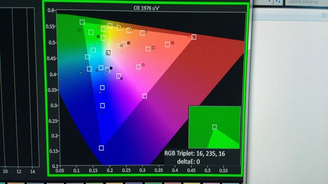
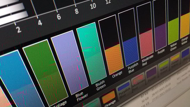
A commonly-used threshold for invisible differences in colour is the CIE delta E system; two colours which differ by 2dE or less are generally indistinguishable. But they're indistinguishable when viewed side by side, not when viewed on an OLED monitor in a dark tent in comparison to the TFT we had mounted on the camera, outside, in the sun, even a few seconds ago (yes, a few seconds matter.) Human beings, even golden-eyed colourists who make a good living out of making things look pretty, do not have the ability to accurately remember what colours looked like. That's true to a huge extent, too – studies have shown errors of eighteen delta E or more, which is a massive error.
So, out in the world, away from the edit suite or grading facility, it is simply not within our power to ensure that everyone gets the same impression of what the picture looks like, not because the monitors aren't good enough, but because the people aren't. Calibration keeps the resulting errors as small as possible, sure, and since we have to set monitors up to some standard we might as well make sure they're right. Side by side matching is, as ever, difficult to do, and it'll always be crucial not to crush or pump up black levels. Even so, the errors in the human brain and visual system are so large that, say, the saturation or hue of a projected image in a cinema could be significantly out before anyone would even be capable of telling it apart from the picture in the grading suite.
Tags: Production

RedShark 2020 @ All rights reserved.

Comments