4 minute read
Advertisement
Despite the obvious advances in all areas of technology, we are still producing user interfaces that suck.
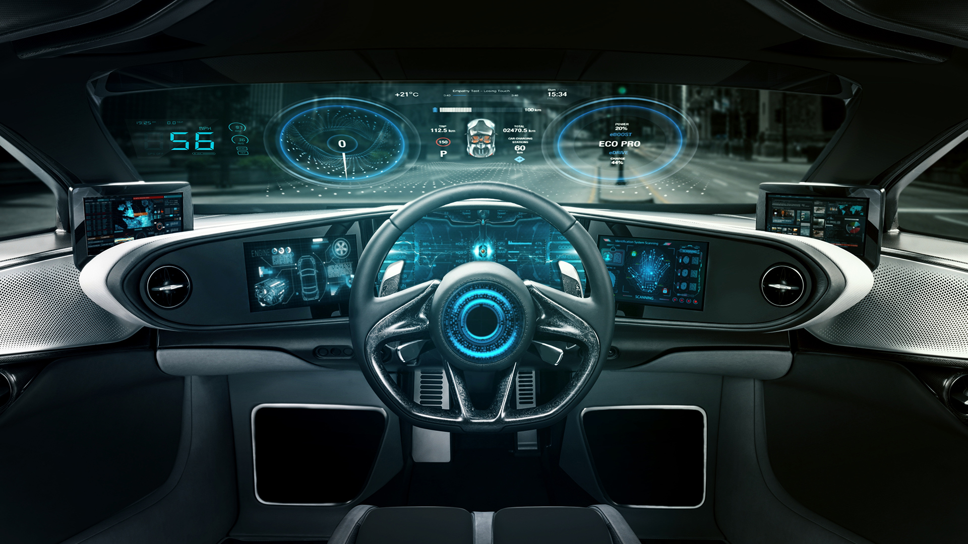
Late last year I changed my car and took delivery of what is likely to be my last internal combustion engine car before I go electric. It’s a Swedish SUV and I have to say that I love it. It’s simply a great car. It’s got a digital dashboard, and a portrait oriented touchscreen for almost everything. Six months later, I’m still confused by it. I’m sure if I studied it, it would make more sense, but part of me feels that I shouldn’t have to study it. Well, all of me, actually.
I’m not here to write about Volvos. Soon, all cars will be iPhones on wheels. There’s no escaping the deeply unsuitable paradigm of a touchscreen - the kryptonite of muscle memory - which is now universal in new cars. One new Mercedes has a screen that’s 54” across. Imagine keeping your eyes on the road while you navigate that! (To be fair, it’s vanishingly unlikely that Mercedes hasn’t considered safety aspects here).
I’m not approaching this from the stance of someone who thinks he can do better. My intention is not to criticise developers. I want to show why it’s so difficult to make a UI that is easy to use, for everyone, in all circumstances.
I’m old enough to have used interfaces that range from the rotary tuning dial on a bakelite shortwave radio to an AI-based voice assistant. I know which one I prefer, and it’s not Siri or Alexa. But you couldn't hold down a button on my shortwave radio and ask what was the population of Bucharest, or to show you the images from your video doorbell.
I’ve also used devices with interfaces that feel like the command line of the CP/M operating system. Come to think of it, most camera’s menus (with the notable exception of Blackmagic) feel like this.
There’s a reason for this. These menus are specialised, not only to a specific task, but to a particular camera. But I’m sure they can be improved. But how?
There’s a lot that goes into designing an interface. Primarily it depends on the device and what it’s used for. Imagine for a minute that the steering wheel in your car was solely used for selecting which mode your car alarm enters when you leave the car and lock it? Not ideal. Consistent with that, imagine what it would be like if you had to access your car’s brakes through a nested menu system. It’s hard to think of anything worse, as you desperately poke around looking for the menu item that says “Emergency Stop”.
So designing a user interface is multi dimensional and has to take into account not just the classification of the individual controls but their accessibility and real-time functionality.
Have you ever seen the flight deck of Concorde? This is a passenger plane that was designed in the 60s to fly supersonically. To say it was complicated is a massive understatement and I believe that in addition to the two pilots it carried a flight engineer. Every square inch of the cockpit was covered in controls. But I think that’s reasonable. You could probably do a better job these days: the cockpit of an Airbus is all screens. But what you can’t really argue is that there should be a panel labeled “beginners start here”. You can’t have a beginner flying Concorde.
It’s always possible to argue that professional equipment should have professional controls and that users should be prepared to learn them if they want to get the best out of their devices. I don’t disagree, but what I don’t accept is that professional equipment has to be difficult to operate. This is true as much for train, plane and car controls as much as those within, say, a video editing system. I think particularly with the NLE, there is so much functionality - probably added, somewhat inconsistently over time - that it will be intrinsically difficult to use and slow to learn.
A long time ago, when I was still young and idealistic (as opposed to now, when I’m old and idealistic) I was working in the pro audio business and - way beyond my competence - had to figure out some aspects of a digital audio mixing console. I thought deeply about it and came up with the idea of a “Mix Description Language” - a way to connect mixer control surfaces together to control DSP audio processing units that would digitally mix the audio. I do think this was a genuinely new idea back then in the late ‘80s.
The power of the concept was that any control surface (the bit with the faders and the knobs) could control any digital mixing console. The way it worked was not by sending low level data but a high level “language” (which these days would be XML) that was arranged according to function and parameters. At the start of the “conversation” the Mix Description Language would have a “preamble” where it swapped capabilities with the device it was to control. So each component (there could be multiple elements) broadcast to the others what kind of commands it could respond to and what the results were likely to be like.
What if you could generalise this to all products. The control surface mentioned above could remain physical or become a software UI on a computer screen or tablet. The DSP mixer would be the application. The two would be completely decoupled as far as the interface is concerned but would remain tightly connected by mapping functional controls to user interface elements.
Every product has features in common with other products - some will have more and some fewer - but there will always be a commonality.
Wouldn’t it be great if we could create an XML file that contained a description of the capability of the device? This would be a hierarchical account of all the capabilities and functions, their ranges, their parameters and their limits. It can be as detailed as it needs to be.
With this in place, it would then be possible to apply different user interfaces. You would be able to choose how you want the functionality displayed and even change the emphasis of the interface depending on the task in hand. Some things would be entirely consistent; others would be able to change around according to the preference of the user and - importantly depending on the context.
AI could play a part in this. It may even be feasible for third parties to design interfaces. Why not? If the functions are standardised, then the designer of the interface needn’t even know the exact capabilities in advance - they would only have to provide for the types and categories of functions.
Would this ever work? I think it could. Is it a good idea? Within reason, yes. Critical, core controls should probably always be in a fixed place. But think about “dark mode” that’s become almost essential in modern OSs. It changes the look of the whole UI. That’s a simple example. So too are the personalisations you can apply to your desktop and user interface elements.
What I’m suggesting is essentially a much wider-scoped version of that.
I would guess that we are getting very close to the point where some kind of remote touchscreen interface will be available for most things. This is a great opportunity to be more flexible, and cleverer, with user interfaces. Let’s leave behind complexity that belongs in another age. Let’s make it easier for ourselves, so that we can spend less time searching through menus, and more time being creative.
Tags: Featured

Written by David Shapton
Advertisement
Advertisement
Advertisement
Advertisement
Advertisement
RedShark is a multiplatform online publication for anyone with an interest in moving image technology and craft. With over 50 contributors worldwide, full-time developers, editorial, sales and marketing staff, it is the go-to site for informed opinion and know-how for the quickly changing video, film and content creation industries.
RedShark 2020 @ All rights reserved.

Comments