3 minute read
In the concluding part of Neil Oseman's series on methods for judging exposure, he takes a look at using camera itself as an exposure tool.
In part one of this article I discussed predicting exposure using photometric data, and the use of handheld spot (reflectance) and incident meters. The remaining three methods of judging exposure which I will cover will use the camera’s sensor itself to measure the light. Therefore they take into account any filters you’re using as well transmission loss within the lens (which can be an issue when shooting on stills glass, where the marked f-stops don’t factor in transmission loss).
In the world of digital image capture, it can be argued that the simplest and best way to judge exposure is to just observe the picture on the monitor. The problem is, not all screens are equal. Cheap monitors can misrepresent the image in all kinds of ways, and even a high-end OLED can deceive you, displaying shadows blacker than any cinema or home entertainment system will ever match. There are only really two scenarios in which you can reliably judge exposure from the image itself: if you’ve owned a camera for a while and you’ve become very familiar with how the images in the viewfinder relate to the finished product; or if the monitor has been properly calibrated by a DIT (Digital Imaging Technician) and the screen is shielded from light.
Most cameras and monitors have built-in tools which graphically represent the luminance of the image in a much more accurate way, and we’ll look at those next. Beware that if you’re monitoring a log or RAW image in Rec.709, these tools will usually take their data from the Rec.709 image.
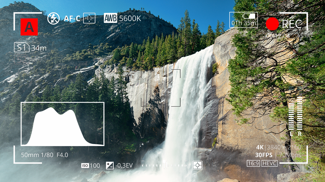
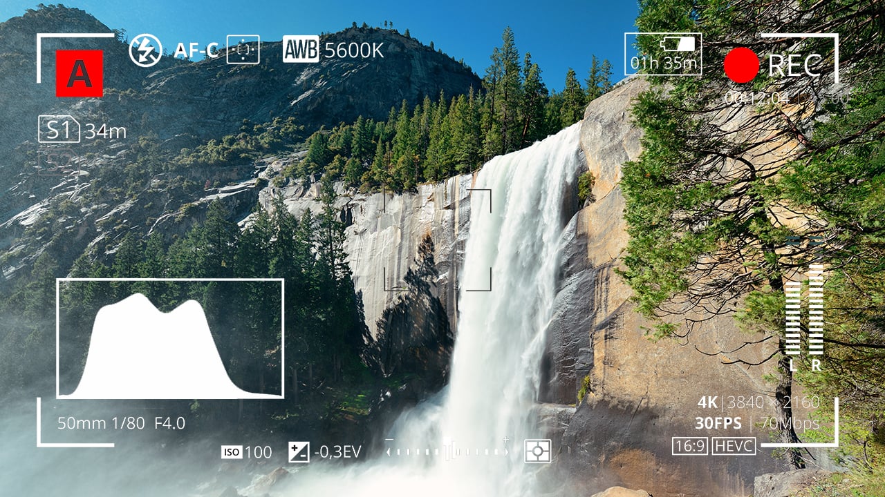
These are graphs which show the prevalence of different tones within the frame. Histograms are the simplest and most common. In a histogram, the horizontal axis represents luminance and the vertical axis shows the number of pixels which have that luminance. It makes it easy to see at a glance whether you’re capturing the greatest possible amount of detail, making best use of the dynamic range. A “properly” exposed image, with a full range of tones, should show an even distribution across the width of the graph, with nothing hitting the two sides, which would indicate clipped shadows and highlights. A night exterior would have a histogram crowded towards the left (darker) side, whereas a bright, low contrast scene would be crowded on the right.
A waveform plots luminance on the vertical axis, with the horizontal axis matching the horizontal position of those luminance values within the frame. The density of the plotting reveals the prevalence of the values. A waveform that was dense in the bottom left, for example, would indicate a lot of dark tones on the lefthand side of frame. Since the vertical (luminance) axis represents IRE (Institute of Radio Engineers) values, waveforms are ideal when you need to expose to a given IRE, for example when calibrating a system by shooting a grey card. Another common example would be a visual effects supervisor requesting that a green screen be lit to 50 IRE.
Almost all cameras have zebras, a setting which superimposes diagonal stripes on parts of the image which are over a certain IRE, or within a certain range of IREs. By digging into the menus you can find and adjust what those IRE levels are. Typically zebras are used to flag up highlights which are clipping (theoretically 100 IRE), or close to clipping.
Exposing an image correctly is not just about controlling highlight clipping however, it’s about balancing the whole range of tones - which brings us to false colours. A false colour overlay looks a little like a weather forecaster’s temperature map, with a code of colours assigned to various luminance values. Clipped highlights are typically red, while bright areas still retaining detail (known as the “knee” or “shoulder”) are yellow. Middle grey is often represented by green, while pink indicates the ideal level for caucasian skin tones (usually around 55 IRE). At the bottom end of the scale, blue represents the “toe” - the darkest area that still has detail - while purple is underexposed. The advantage of zebras and false colours over waveforms and histograms is that the former two show you exactly where the problem areas are in the frame.
I hope this article has given you a useful overview of the tools available for judging exposure. Some DPs have a single tool they rely on at all times, but many will use all of these methods at one time or another to produce an image that balances maximising detail with creative intent.
Title image courtesy of Adobe Stock.
Tags: Tutorials

RedShark 2020 @ All rights reserved.
Comments