
3 minute read
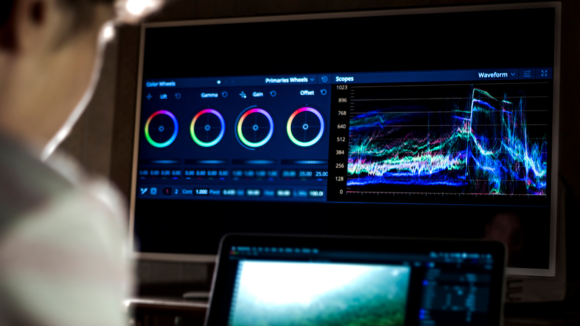
Our previous article showed the basics of creating a primary colour correction and why primary colour correction is essential for an outstanding final grade. Our next step is to apply secondary colour correction. Secondary colour correction is essentially the selection and changing of a single colour within the picture without altering anything else or disturbing the general look we want to create.
In the early days of colour grading, secondary colour correction was extremely basic. You were limited to fixed widths of selection. You had a choice of selecting Red, Green, Blue, Yellow, Cyan or Magenta. Once selected, you could then alter the hue, saturation and luminance of the selected colour. Since the selection area was a fixed width, the result was that anything in this particular range of colour would be changed. If you selected Blue with the intention of changing the colour of the sky, everything else in the picture that was blue was also changed. Later developments in colour grading technology allowed you to qualify or separate a colour based on the hue, saturation and luminance properties.
Once separated, you could then change the hue, saturation and luminance for the qualified colour. Some manufacturers further extended this functionality to separating colours using only luminance values or even red, green and blue values. An example of this added functionality was the ability to separate the colour of a sky or a flesh tone without changing other items and was done by differentiating their colour values.
In today’s world of colour grading, a secondary colour correction isolation starts out with selecting the desired colour to be altered, generally by positioning a cursor over the colour and clicking on it. Once you click on the colour, the software then selects the default colour qualification, generally by the hue, saturation and luminance values.
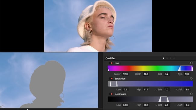
You can then monitor the selection by viewing the generated matte of the qualified area. You may then alter the Hue, Saturation and Luminance controls within the software to select how much more or less of the colour is being selected. For example, when creating a separation for the sky, you should first adjust the Hue centring adjustment to show the optimum amount of the sky area to be changed. You may then proceed to the Hue width control to eliminate other items in the picture that share the same colour as the sky. There may be other colour values that result in undesired objects showing up in the image matte. For this reason, we then proceed to adjust the high and low Saturation qualification adjustments. This allows us to further differentiate the colour based on levels of saturation. You’ll come to the final control of adjusting the Luminance qualification selection. This allows for colour differentiation based on differences in luminance values.
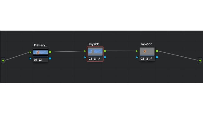
Now that we have pointed out how to select and qualify a colour, it’s important to point out when this is still not enough to achieve the desired result. For example, we have a picture of three apples and only want to change the colour of one. This could be a problem if all the apples shared the same hue, saturation and luminance values. In this instance, the addition of a mask or window could be added allowing the qualification to be only applied in the specified area or, in this case, the specific apple. Another item that can cause problems with secondary colour correction is compression.
When working with compressed media, altering the luminance of a qualified colour should be avoided as this will result in the visibility of compression artefacts seen in the picture. Many manufacturers have introduced tools within their applications to minimise this issue by softening the qualified matte area. The best results for secondary colour correction or colour qualification can be seen when working with uncompressed or RAW material. A good tip when working in a serial node workflow whereby each node is looking at the effect of the preceding node’s correction is to apply additional saturation in the preceding node’s primary colour correction. This will result in additional colour information and allowing for easier secondary colour correction qualification in later nodes.
Finally, we come to practical uses of secondary colour correction. When working on commercials, secondary colour correction is generally applied to product shots in order to make the product stand out more and to make sure that the colour accurately matches that of the actual product. For feature films, we are generally a little more conservative about applying secondary colour correction. As we did in our previous article, we turn back the clock to the days when I was grading the Technicolour musicals of the 1940s. A default primary colour correction resulted in an acceptable picture but the flesh tones and yellows were a bit off. To be more exact, the flesh tones were a bit magenta and the yellows were more yellow green. In order to fix this, I used a red and yellow fixed Secondary colour Correction qualifier. By adjusting these together, the result was a yellow that was more orange-yellow and flesh tones that became more yellow-red instead of magenta. This was more representative of the colours seen in the original Technicolour dye transfer film prints.
Blackmagic Raw media files courtesy of Dima Kalenda and Blackmagic Design.
Tags: Tutorials

RedShark 2020 @ All rights reserved.

Comments