3 minute read
Phil Rhodes kicks off a new series looking at how you can recreate that essential vintage look with a discussion of title sequences.
By now, most people are aware that current camera tech can give us far more image quality than is really good for us. Some people reach for optical filtration, vintage lenses or even a round-trip to film and back, all of which are interesting and impressive and a great basis for covetous discussion over any lunch that’s served from a magliner.
Discussions of compositing technique tend to go down less favourably. It involves software with a wormhole learning curve, and who’s got time for that sort of propeller-headery when there’s anamorphics to lust after. The voice of dissent, meanwhile, arises from people who don’t like the idea of spending £500 on a piece of carefully dirty glass, or ten times that on a deliberately ungood lens.
Much as those are traditionally the concerns of the high end, more and more people are cranking out short films for YouTube, and might be confronted with the reality that a bad skin day is being worsened by the zit-enhancement features of a super-sharp modern stills lens. Those are also the people least able to fund the optical solution and least likely to care about the puritan zeal of old-timers who’d prefer everything to happen in camera.
The advantage enjoyed by those underfunded content creators is that they have more than average control over their post process. They can rely much more reliably on digital finishing than a bigger show involving lots of people who might decide that actually, you didn’t want that, after all, you wanted this. In either case, the main challenge is satisfying people for whom it’s an almost religious transgression to suggest that the effects of classic glass can be vaguely approximated by any combination of software filters.
Well, that sounds like a challenge.
Naturally, we’re not suggesting that simply applying a small-radius blur is the right way to… well, actually there are plenty of people out there who routinely soften all on-screen lettering by a pixel. Breaking the curse of excessive sharpness like that works, although it interacts awkwardly with the common practice of rendering titles four pixels high on the basis that smaller text looks more like it was intended for forty-foot screens. In 2023, cinematic is squinting at your cellphone.
But back in the day, when titles were hand-lettered on card and shot on a rostrum camera, they were as subject to lens effects as anything else, and probably nobody was paying much attention to what glass was being used for that. As a result, one of the easiest ways for a modern production to curse an otherwise wonderful opening sequence is to besmirch it with a TrueType font sharp enough to take the viewer’s eye out.
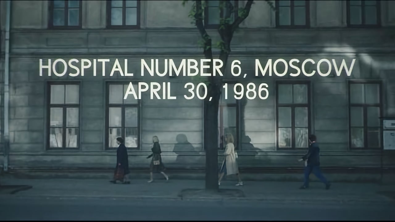
The best counterexamples are probably the titles created for Chernobyl, which were often overlooked in the rush to congratulate everyone involved on every other aspect of the production. They look as if they were painted by hand onto cards by a signwriter of less than exceptional skill, and they look exactly like they should. Kerning is rough; weights are variable, and you can almost see the brushstrokes.
Crucially, they’re not entirely white. Anyone who wants really bright white titles might consider that matte white lettering exposed on film according to the manufacturer’s recommendations will not achieve the absolute maximum density on the negative. Film exposures traditionally retain some brightness range above the brightness of a well-exposed matte white surface, for specular highlights and lightbulb filaments. A white title might hover on that edge.
What that means is that really white titles, as well as being less than entirely sharp, might not be quite as white as some of the other things in frame if the exposure was fractionally low. They might also flare slightly if the original exposure was a little high, or ramp between those situations in a vignette. The kind of glow created in that sort of situation, taking into account historic lenses, can be simulated with a large-radius blur composited back over the original text. That’s less likely to be visible on titles that aren’t bright white, not on a very dark background, or while a very white title is fading in.
Sometimes this crosses over with overt motion graphics and title effects, and the results don’t have to be as retro as Chernobyl. The computer game Alien: Isolation reshot its titles from CRT displays onto VHS for a powerful whiff of the late 70s. Similar things can be done with TFT displays for a more sci-fi aesthetic, with the result that the future is as fuzzy as the past. Usually, though, we’d prefer the audience didn’t notice what we were up to, so the watchword is subtlety. Making titles look real and organic and appropriate for any production is not so much about adding an effect but removing a problem that’s never more than a few pixels wide.

Experienced post people giving lectures at NAB have often proposed that a tiny conventional blur might be all it takes to set a title more realistically into a scene, and that in this day of razor-sharp fonts, doing that should probably be more the rule than the exception. Some of the more advanced effects, particularly around adding glow and introducing tiny distortions, are the sorts of things that lenses might add to our original footage but when it comes to the pictures themselves, there’s even more need for subtlety.
Tags: Post & VFX

RedShark 2020 @ All rights reserved.

Comments