
5 minute read
 Sekonic C700R and Practical Lighting
In an update to our recent RedShark Review of the Sekonic C700R spectrometer, here are our findings after pointing the colour temperature measurement device at various common practical lights.
A little while ago, we looked at Sekonic's new C700R colour meter and concluded that it was a worthwhile bit of kit, particularly given recent developments in lighting. The ability to read a complete spectral response from any light source is something that cinematographers in the past might not have valued. This was because, for most of cinematographic history, illumination came in two varieties: tungsten or daylight. Now, the desire for more light for less power, less set-up time and less money forces compromises on us.
The C700 series meters certainly allow us to evaluate that compromise in an objective sense. There will always be circumstances under which we might deliberately want to use light with unusual colour rendering deliberately; after all, Blade Runner is a milestone of cinematography and delights in featuring various lighting equipment which probably has a colour rendering index of about three. At that point, the cinematographer is working more toward the look of the film as a whole than in the interests of accurately rendering any particular object in scene. More commonly, though, we'll be willing to accept a degree of compromise in the colour quality of lighting in return for some of those cost and convenience advantages. It's at this point that getting a more scientific idea of what's going on is key.
These are broadly the conclusions of our C700R review, but what we didn't do in any great depth is look at examples of common lighting as assessed by the meter. Let's start off with one chart we did include:
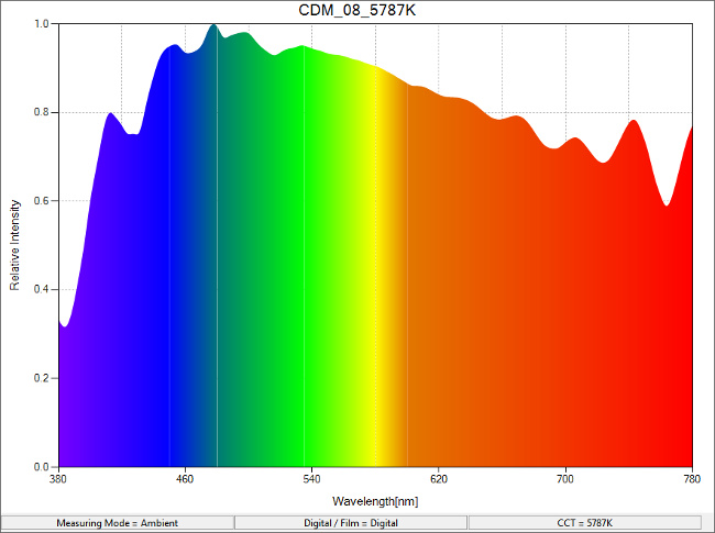
This is the spectrum produced by an overcast sky, hence the increased intensity in the blue. Sekonic tells us that the meter is capable of reading at one-nanometre intervals, suggesting that those suspiciously regular oscillations in the extreme blue and, particularly, red ends of the spectrum are genuine characteristics of the light source, not instrumentation errors. While it might seem intuitive that the sun should produce equal amounts of all the visible wavelengths, various optical phenomena in the atmosphere (including that which makes the sky blue) conspire to put some lumps in the graph.
The meter has assessed the colour temperature of this light as 5787K, which is close to the theoretical 5600K of daylight, although far enough apart that a side-by-side comparison would reveal the difference. The visibility of a shift in colour temperature is measured in micro reciprocal degrees, better known as the 'contraction mired'. A mired value is calculated by dividing one million by the colour temperature in kelvin, so this sky light has a mired value of about 173 (the million is there to avoid mireds being very small quantities – the direct reciprocal of 5787 is one divided by 5787, or 0.000173).
The purpose of mireds is to produce a quantity that represents, with reasonable accuracy, a perceived change in colour as observed by average human beings. Kelvin measurements don't do this very well – increasing colour temperature from 2000K to 3000K looks, subjectively, like a much bigger change than moving from 5000K to 6000K, although both are changes of 1000K. With mireds, this situation is properly represented. The difference between 2000K and 3000K is 167 mireds. Between 5000K and 6000K is 33 mireds, a smaller number representing a smaller visible difference. The difference between ideal 5600K daylight and our 5787K test represents a mired shift value of -6 (negative numbers making things bluer). A one-eighth colour temperature blue filter, for comparison, has a mired shift value of about -18, so the error is about a third of one-eighth CT blue.
Let's look at the colour rendering performance of our local star:
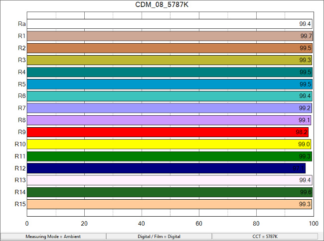
As one would expect, the CRI of true daylight is excellent, measuring 99.4. Bear in mind, though, that Ra (for average) is an average of R1-R8 and doesn't include any representation of the more saturated R9-R15. The first eight colours are sufficiently unsaturated that small spikes in colour rendering are easily overlooked. Let's look at another light source that's widely used in filmmaking and which has a rather more, let's say, eventful output.
This Austrian alp of a spectral output is created by a Philips TL-D 90 Graphica 36W/950 fluorescent tube. The peak just above 540nm is the remnants of the infamous green spike of fluorescent tubes in general, but this is a much more modern design which achieves a colour rendering index in the 90s and shouldn't exhibit the classic problem with an overall green cast. These tubes are widely used in circumstances where practical lighting on location must be replaced with something better and don't generally cause problems. Examining the CRI chart, though, does reveal a couple of things to keep in mind.
As we see from the low R12 bar on this chart, the standard CRI measurement assesses this tube as slightly lacking in deep blues. This is surprising, given that the tube has an enormous blue peak in its output (as it should, being notionally a daylight-emitting device), but this situation reveals a simple problem: the R12 blue is not the same wavelength as the blue output in the tube. Performance in yellow is similar because the yellow is placed between the red-emitting and green-emitting phosphors in the tube's construction. We can clearly see this from the spectral data. Neither of these results is sufficiently severe as to suggest serious problems, but it's an interesting example of what happens when the spectrum coming out of a light happens to be deficient in some specific colour that we'd like to illuminate. Put that very specific blue, or that very specific yellow, in front of this tube, and it will appear (very slightly) muddy and underexposed.
Let's look at something that may create more severe problems:
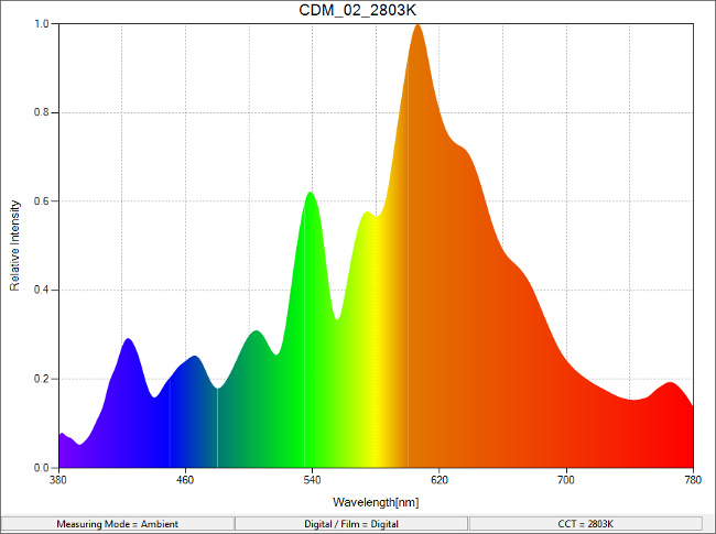
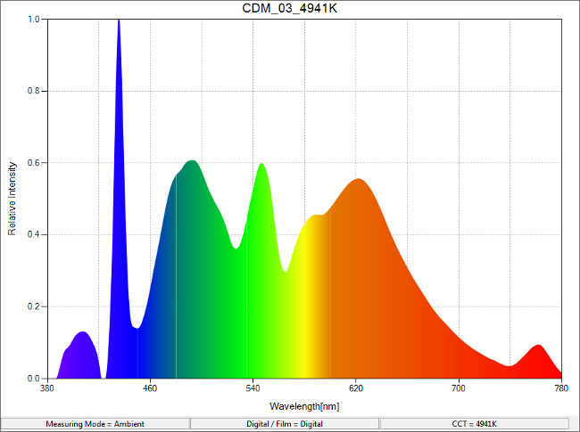
This chart represents the output from a Philips MasterColour CDM-T 150W metal halide discharge light. In person, the light appears a warm and healthy gold, very much like 2800 to 3000K household tungsten, but in this chart we can already see a potential problem: the warmth of the light comes from a large peak in the yellow-orange-red region. Deep reds are rather lacking and this is crucial because deep reds are key to rendering human skin tones, of whatever variety, convincingly. This issue is duly recognised in the CRI assessment:
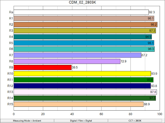
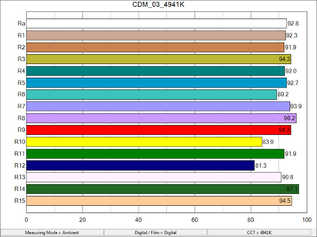
Initially, colour rendering looks good, assessed as 92.3 based on the first 8 samples. However, glancing down the chart, we can see that even the R7 and R8 colours are underexposed due to the need for deep reds and blues to render these standardised lavender and purple shades properly. Perhaps surprisingly, the R12 graph is very healthy, although we can see from the spectral output chart that the light is generally somewhat low in blue, hence its low colour temperature (although that's fine if you need to match tungsten). Possibly the R12 test colour lines up with the peak at about 460nm and there might be issues with other, fractionally different deep blues. The real problem, however, is in the red, which is considerably less than ideal. This light source might be usable in film and TV work, although its use on human skin is probably only made practical by the attractiveness of the warm mid-frequency output.
Finally, let's look at something known, good and reliable:
This is the output of a conventional tungsten desk lamp – not a high-temperature tungsten-halogen source as used in film and TV lighting, but a sixty-watt domestic bulb. The huge preponderance of red is as expected for a source of only about 2500K colour temperature, but the CRI remains superb:
This sort of source is a good approximation of a theoretically ideal light source, as reflected in the superb colour rendering performance. Even the deep blue R12 bar achieves 86.4, although this is a normalised result taking into account the colour temperature of the source and we wouldn't expect deep blue objects to be well-exposed under this light source.
Is there a moral to this story? Perhaps, but please, let's not expect to shoot everything under sixty-watt light bulbs. For a parting shot, let's look at a really, really bad guy:
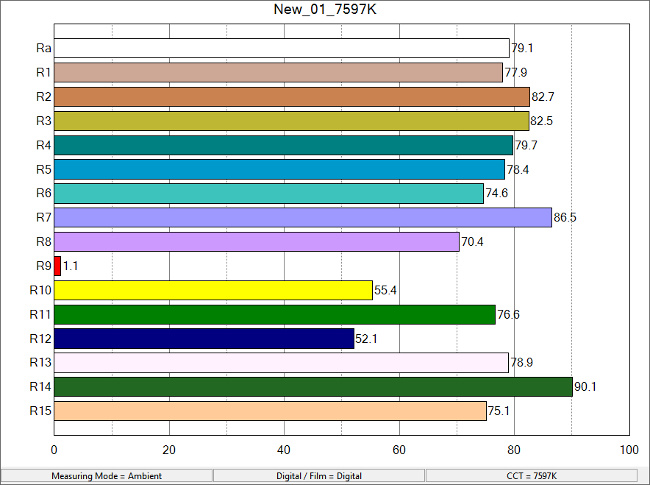
Guesses as to what this represents are welcome in the comments below, but the R9 result of 1.1 is, to date, a record holder for awfulness in your correspondent's experience.
Tags: Production

RedShark 2020 @ All rights reserved.

Comments