2 minute read
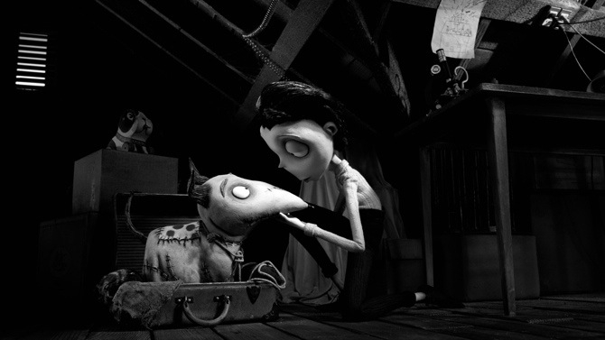
 Frankenweenie
Tim Burton’s stop-motion Frankenweenie calls for black and white grading
When Tim Burton needed a team to handle the color grade on Disney’s big budget 3D remake of Frankenweenie, he turned to some old friends at Company 3’s London office. Several members of the local staff lent their talents to the director’s retelling of Sweeney Todd, so they were equipped with first-hand knowledge of Burton’s process and expectations.
But Frankenweenie was a different beast. It’s the story of a boy who, with the aid of science and electricity, resurrects his deceased pet, albeit with a few side effects. Originally a short film, Frankenweenie (1984) abruptly ended Burton’s first run at Disney. Company brass accused the animator/filmmaker of wasting funds and producing material unsuitable for children. Flash forward 18 years and it all comes full circle as Disney places a big bet on Burton’s vision.
Burton reimagined Frankenweenie as a stop-motion, black-and-white animated tale, creating a host of unique challenges for his post team. Rob Pizzey, the colorist on the film, stood as the final gatekeeper, ensuring that Burton’s visual mastery survived intact. He leaned heavily on the features of Da Vinci Resolve, such as auto-tracking and auto-keyframing, to produce a winning outcome:
“We had to be very careful with the contrast range, not to push it too far. If you push too far, you can introduce strobing effects, which isn’t good. We had to hand animate an awful lot of shapes on characters to make them stand out more. As the film is black and white, the characters costumes didn’t stand out as much as they would in a color film, and so we worked on creating different shades of grey to create better separation.
“In addition, we also spent a lot of time creating the LUT for film out. The final delivery was color negative to color print for a black and white job. As you can imagine, just a slight sway in the print and the film could look completely wrong. However, the LUT created by our technical department worked beautifully.
“So we graded the 2D version of the film first and, once that was signed off by Tim, the 3D data was delivered to Company 3. Now on some 3D films, one eye of the 3D is common to the 2D version. However, that wasn’t the case on Frankenweenie and so there were effectively three films to conform and grade; 2D, left eye and right eye. It was a big job and we had to make certain that nothing slipped through the net on any version.”
How to grade black and white
While Da Vinci Resolve was instrumental in realizing Frankenweenie (2012) for the big screen, some of the lessons can be applied to any color grading workflow, regardless of program or hardware. If you ever find yourself color grading an animated black-and-white film for Tim Burton (heh), constrain the contrast range to prevent strobing, animate color masks for character elements, and use LUTs to eliminate overall color variance (especially for film out). Now go forth and color grade some black-and-white!
Tags: Post & VFX

RedShark 2020 @ All rights reserved.

Comments