4 minute read
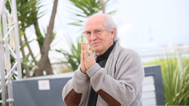
 Vittorio Storer at the 'Cafe Society' photocall. Cannes 2016
Alister Chapman recently attended the Cinegear show in Los Angeles where he was giving some presentations on HDR, log and raw. But he was also tasked with filming two of the sessions presented by Vittorio Storaro as well as his session at USC on the Sunday. And they were fascinating.
At Cinegear his latest work, Café Society, directed by Woody Allen was screened from a 4K uncompressed master on the big screen at the Paramount Studios cinema.
Vittorio is probably most famous for his work on Apocalypse Now, a film that is almost legendary for it’s surprising and quite disturbing look at the human condition. Marlon Brando’s portrayal of a rogue army officer come spiritual leader and deity is both bizarre and disturbing.
At the USC event a reel of some of Vittorio’s early work was screened including clips from 1900, The Last Emperor and Reds. Another film that I remember well from my youth is Ladyhawke. One thing that really stands out in these films as well as Café Society is his use of vibrant and vivid colours.
During his talks he made many references to this. For him colour is a tool to help tell the story, not just to create a look but as a visual story telling tool. For example in Vittorio’s works reds and oranges are used to represent birth or a beginning while purple may indicate death. It was really interesting to see how in “1900” he used a vivid orange light on the face of a boy to portray a sunset. The orange light was intense, a lot more intense than you would see in many modern films. Again in Café Society intense colours were used to alter the mood of the scene, not just light and dark contrast but also stark colour contrast.
When asked about where his inspiration came from Vittorio would refer to his study of past masters such as Leonardo DaVinci and he was clearly passionate about learning from the past. When he studied The Last Supper he was struck by the symmetry of the painting and as a result chose to emulate this symmetry by shooting in a 2:1 aspect ratio.
For me the one thing that struck me about Vittorio was that he wasn’t afraid to push the boundaries of film or video technology. One very interesting thing he said was that even though the current electronic cinematography cameras are not perfect, if we don’t use them and push them, they won’t develop and get better. It’s only through pushing the limits that we can drive the technology forward. Café Society was shot on a Sony F65 camera and he was quite adamant that this was the only camera that he would use today. A big part of the reason was it’s 16 bit colour which allowed him to “write” with colour.
Vittorio describes Cinematography as a form of writing, not painting because when you paint you create a single frame or image, but we are not making single images, we are telling a story through imagery and by using colour and contrast we can tell a story in the same way as a writer does.
When asked about the sensitivity of modern cameras Vittorio wasn’t particularly complimentary. He referred back to shooting on film where in daylight he would have 100 or 200 ASA film stocks and perhaps a 500 ASA tungsten balanced film stock. He feels that modern cameras, including the F65 (800 ISO) are too sensitive, forcing him to use a lot of ND filtration which he felt compressed the contrast and reduced the colour range (something I’m not sure I agree with, but it warrants further investigation).
He was quite vocal about the need to shape the light in a scene, either through adding light or modifying the existing light and even went so far as to imply that many modern camera users were becoming lazy and not bothering to do this as modern high sensitivity cameras will provide an image in almost any lighting condition.
Looking at his work you can see how aggressive he is with light and colour contrast compared to so many “modern” cinematographers. His films have a distinct look, very different to the typical subdued and almost monotone colours of the current “blockbuster” look. They are bold and striking, perhaps not to everyone’s taste, arguably some of his early works have a vivid “video” look to them. But this is what makes his cinematography stand out, it is bold, it is striking, almost shocking at times and perhaps he’s on to something.
We have the tools now to capture an incredible colour palette. With HDR and Rec-2020 we can make images reminiscent of the bold Technicolor films of the 70’s but with better contrast. Perhaps this is the way films should look.
I’ve recently been watch some older films, often made 10 years ago or more to kill time on my travels. What has struck me is how colorful films from the past were. I watched Braveheart the other day (1995) and it was full of colour. Grass and trees were a luscious green that reflected the wet Scottish weather, there was none of the almost monotone, bi-colour skintones and teal look that has become the de facto standard for current movies, short films and web videos.
I think we are missing a trick and I think Vittorio is right. While for me some of his works is too intensely colourful, his use of colour is far more interesting than todays bi-colour obsession. We have cameras that can capture incredible colour ranges, but half the time we choose to throw those colours away because it’s not fashionable or looks too much like video. Take a look at the original Wizard of Oz. Amazing use of colour, but you could argue that it looks like video or TV. But the Wizard of Oz was film and it was shot long before colour TV.
I look forward to seeing what can be done with HDR and Rec-2020. We can now display a colour pallet and dynamic range far closer to what we can actually see rather that the tiny slither of the visual range that Rec-709 can display. It’s a very exciting time to be in this business, let’s not waste this ability to explore the full world of colour.
Vittorio Storaro picture by Shutterstock.com
Tags: Production

RedShark 2020 @ All rights reserved.

Comments