3 minute read
[Updated] Imposing a "strong" look on a film can take all the original goodness from it. Phil Rhodes wonders whether we can take the concept of "skin tone" seriously any more.
[Update: Some people are claiming that VideoLab has admitted that it deliberately darkened the original film used in this comparison, which they apparently said was for comic effect. We're not going to take a position on this: Phil's article is about extreme grading in general, and while he does refer to VideoLab's comparison and uses their screenshots, it doesn't detract from his central message. If you're curious about this controversy, a little searching online will bring up the relevant links]
A little while back, I wrote an article in which we explored the rendering of human skin tones. Camera and postproduction people are often almost obsessively concerned with this photographic characteristic in evaluations of cameras and the people who use them. The thinking behind that piece was to air the idea that this stuff is almost completely subjective – particularly with regard to the flexibility of colour grading, it's almost meaningless to describe certain characteristics of skin tone rendering as objectively incorrect. Of course, there is considerable consensus of opinion on this point, but it's far from universal, there are many outliers, and we should not be led unthinkingly into the idea that this is anything other than highly subjective – especially as the consensus is all too often that people should be a colour that I'm going to christen Bay Orange. We don't all want to live in a world where mainstream American movies dictate opinion, especially when we don't all live in a place where the sunset each evening is guaranteed to be golden. Well, I mean, we may already live in that world, but we don't necessarily want to.
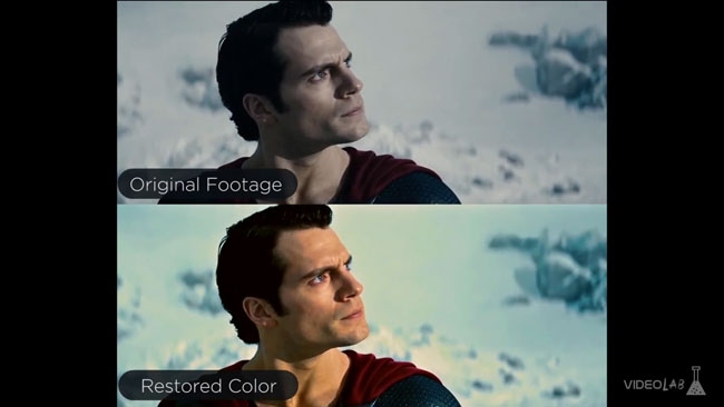
Even given all this, though, it's more than slightly unusual to find concerns of colour grading breaking into the mainstream consciousness. The fact that Man of Steel was an attempt to make Superman gritty and realistic is a well-enough aired topic, and the idea that this was perhaps slightly misguided is barely any more controversial, but to find a public-facing youtube channel going viral with a comparative exposition on just how grim it looked is a bit unusual. And it's hard to disagree: as ever, observers don't need to be particularly expert or practiced to see the difference when it's presented side by side, as it is here.
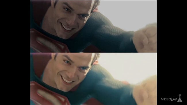
The visibility of differences between two pictures doesn't necessarily provoke a value judgment as to which is better, but the more-saturated version doesn't in general look wrong, and that's meaningful, because oversaturation looks nasty almost immediately. Undersaturation just looks – well – grim. Sometimes that's okay; the issue is appropriateness, and that, of course, is entirely in the eye of the beholder.
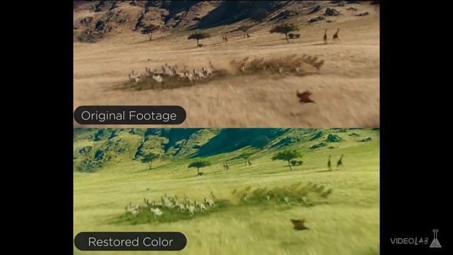
I say “in general”, because there are moments of failure in what's being referred to as the colour-restored version. A shot of Superman flying over the African plains is rendered a dry and dusty brown in the original, but has been tinted an unconvincing bright green in the proposed higher-saturation version. This, in my view, is a misinterpretation and a mistake; the grass was never green, it was always brown, and as a result of this perhaps clumsy intervention the zebra are green too. (It's not fair to be too critical here of the saturated version because it's only trying to make a point - which it does, very well). Maybe it could have been a deeper, richer shade of brown, but this is the African savannah, after all. In direct comparison it'll always be easy to claim that the more saturated version is over-the-top, though, and in general the “recovery” is fairly well judged - more than well enough that it would in general have gone unqueried at the cinema.
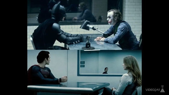
Ultimately, the colour grading decisions on Man of Steel didn't stop it taking six hundred and sixty-eight million dollars at the box office – more than three times its already gigantic production budget – and there's nothing intrinsically wrong with a bit of grimness, as the Dark Knight series makes clear. The resulting discussion of directorial intent could take all night, but we can reasonably conclude that the problem is not the grade, it's the combination of grade and subject, and that's something that the video touches on but could make a bit clearer. Batman is not Superman. The real concern seems to be that the creative decision making was dictated by a need to ape a previously-successful project, and people seem to be more concerned by the impression of financially motivated film directing than the pictures themselves.

Ultimately, again, this is all about taste and convention. The Geoffrey Unsworth photography of the original Superman movie is fairly conventional in terms of colour treatment, but uses quite a lot of diffusion, as was the fashion at the time. It looks like what it is: a product of the late 70s. Whether Man of Steel will look ringingly like a mid-2010s movie when examined by commentators of thirty years hence is another matter, but fear not – if the YouTube experiment proves nothing else, it shows that the 2040 Criterion remaster will be more than capable of pulling colour out of the original material if, by that time, commercial expediency demands it.
Thanks to VideoLab for their efforts in bringing this issue to everyone's attention. All stills from their YouTube video
88
Tags: Post & VFX

RedShark 2020 @ All rights reserved.

Comments