4 minute read
 The price of beauty: Ulysses 3
Creative writers need tools that don’t get in the way. K. Stewart looks at promising new application
If you're in the writing business, be it writing a movie script or simply making extensive notes for a production shoot, then you'll be aware the choices for creating content have never been richer or more varied. For many, MS Word's labyrinthine features are at best a distraction, at worst a time-sink and hindrance. And with iOS/Android MS Office versions apparently being pushed back to 2014, with a likely tie into subscription services, there's never been more interest in alternatives.
Ulysses 3 is a particularly elegant expression of this creative explosion in writing tools. Its entire raison d'etre is a demolition of the previous version, a radical ground-up re-imagining to focus on the core experience and strip away clutter. To re-state; Ulysses 3 is in many ways less powerful than Ulysses 2 with significantly less features. But that, in turn, provides for a more focused experience and also easier iOS integration.
Ulysses has always been about focus, in particular the separation of content from layout. If you've ever found yourself spending more time fighting with Word's auto-format than actually writing, then Ulysses offered a real breath of fresh air upon its debut in 2003. The separation of text from formatting, commonly called semantic editing has been around since the 1980s and LaTeX. However, Ulysses helped popularise the approach on Mac, shifting the focus from formatting to the creation and organisation of content.
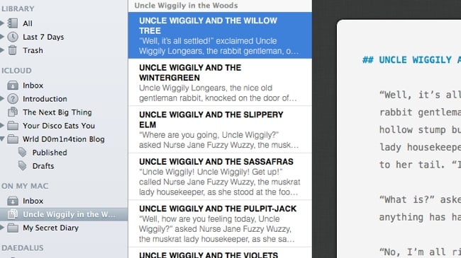
Working in Ulysses is, in a sense, like working in a NLE with text elements as clips arranged in folders and easily, endlessly re-arrangeable. Want to move chapter (stack) 1 to later in your novel? Move a scene (sheet) within a chapter? Simply drag and drop. Ulysses 2, released in 2010, offered a slick, powerful workflow but all its new features didn't make it a breakout hit. Simply adding more features didn't seem the right direction for Ulysses 3…
In the meantime, the organisational vision of Ulysses had been taken in a different direction by Scrivener (Mac/PC) which debuted in 2007. It too focused on text elements rather than formatting, but added the visual metaphor of a writer's cork board with index cards. Writers who once plotted by re-arranging cards on a table, could now do so digitally. It was a big hit on Mac, and a PC version has followed.
As an ever-growing testimonial page for novelists and scriptwriters proves, Scrivener is now a benchmark program for creative writers. Scrivener 2 further extended the writer friendly vision, even adding a feature to auto-generate character names, but its rich sophistication has made it a more daunting program to work with. Comprehensive customisation options make it possible to rebuild it to your own tastes - but not easily.
For a time, it seemed Scrivener would rely on third-party applications such as a iA Writer, Index Card and Textilus to extend its writing experience to iOS devices. This changed in 2012 with an iOS version confirmed, but development has been slow and it's clearly defined as a cutdown version for mobile use, rather than a radical re-imagining.
The Ulysses team had always been about focus and minimalism, so it's to be expected that iOS's radical simplification of the user experience would have a bigger impact. Rather than create a Ulysses iOS, the team went back to zero with the innovative and visually impressive Daedalus Touch app that debuted in 2011.
As development proceeded, the idea of a Ulysses X - 'an iMovie 8'-style reset of the program - emerged and built upon the visual impact of the iOS app to provide something a world away from the original Ulysses UI. The degree to which iOS permeated the new Mac program can be judged from an option to choose an iOS style cursor rather than the usual Mac OS one.
Another example would be the way in Ulysses you can join separate texts into a single scrolling shift by clicking/highlighting the ones you wanted 'joined'. A simple, intuitive idea that (admittedly) took me a while to figure out. In Scrivener 2, there is, of course an icon. It's an evolution of a 2007 program, after all, feature rich with many menu-bars and customisation options.
The contrast between iOS/tablet and conventional desktop software is one of the things which makes Ulysses 3 so fascinating. It makes working on a Mac feel like a big iPad, which depending on your perspective can be a refreshing exercise in beautiful minimalism or a needless reduction in functionality. Why not have lots of tiny icons to make features easily accessible via the precision control of a trackpad or mouse?
In terms of core functionality, a key idea of Ulysses is a single library to contain all your text, always available and with iCloud integration to extend that vision to other Macs as well as iOS devices. iCloud is famously not easy to work with and devblog attests to the pain of making it work for Ulysses.
Simply put, the idea is that you can work on content on any device and switch between them as necessary without worrying about manual synching. For Scrivener, you synch at exit, synch at resumption and it's all very logical - albeit a little clunky. Ulysses does away with manual synching so you shouldn't need to worry about whether you'd closed your last writing session with a synch or not. This is a great feature and mostly works as advertised, although admittedly I've seen a warning that two files were clashing and had to choose between them with little indication of differences between them. (Dropbox and other alternatives are supported for iCloud skeptics.)
Moreover, you might expect after selecting iCloud synching, everything would be shared everywhere. This isn't the case, however, you must move any file you want to be editable on Daedalus Touch into its folder structure. When this is done, synching is usually seamless, so you write on Mac or iOS as you feel necessary, unfortunately at the moment the Daedalus file structure isn't as sophisticated at Ulysses with no support for nested folders.
The stripped down nature of Ulysses extends to its core engine, which is all about plain text with support for markdown, a relatively friendly language for inserting links, minimal styling etc. Its simplicity has made it increasingly popular, although it's not essential to use if you stay within plain text with normal keyboard shortcuts for bold and italics.
In conclusion, Ulysses 3 is at £27.99 a stripped down but still pricey alternative to the far more powerful Scrivener 2 (£31.99). Aside from the elegance of its iOS integration with Daedalus Touch it's difficult to recommend version 1 right now, although personally its clean, simplicity makes it the writing app I generally use right now. Whatever its feature limitations, it's simply fun to use. With a trial version recently posted to the Ulysses site, it's well worth a download to experience what a post-MS Office world might feel like.
Tags: Production

RedShark 2020 @ All rights reserved.

Comments