
4 minute read
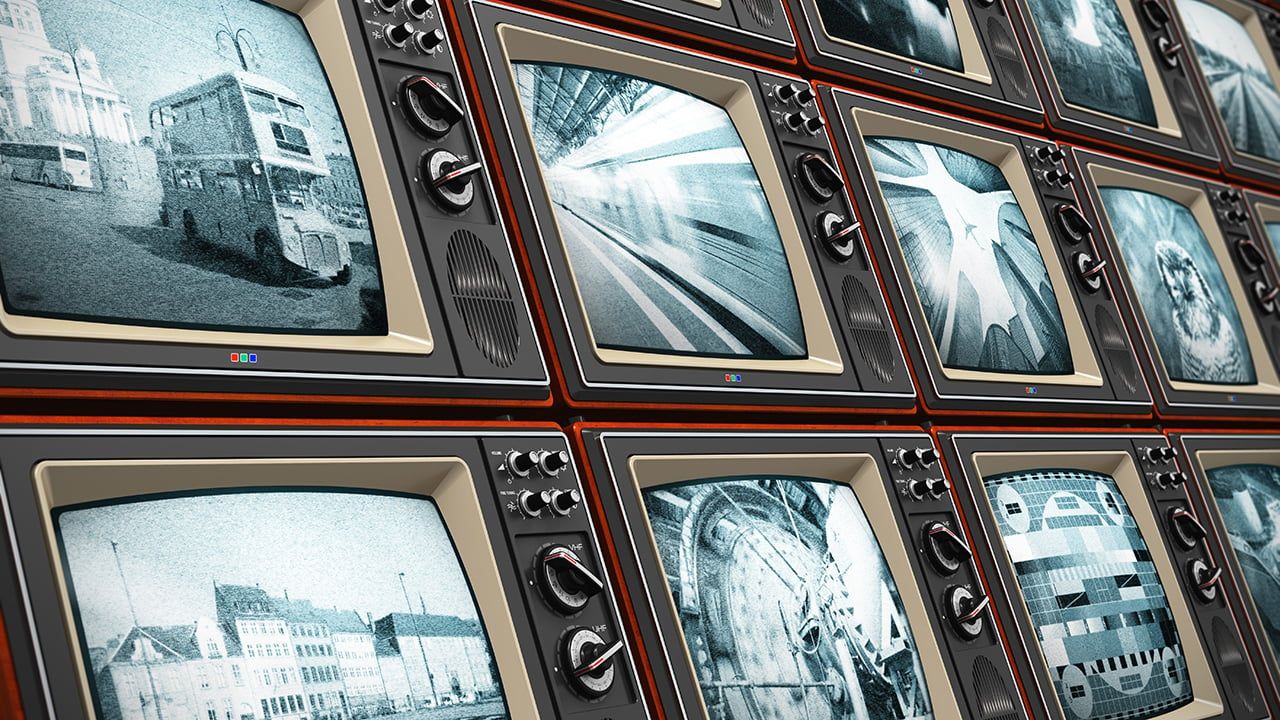
Replay: Incredibly over 7000 households in the UK still hold black & white only television licenses.
Aside from perplexing our Stateside readers with the idea of a television license in the first place, does black and white really still have much of a place in todays television and film production?
What’s the place of black-and-white moving images in today’s culture? On the one hand, Peter Jackson has just released They Shall Not Grow Old, colourising World War One footage to make it more accessible to a modern audience. Yet, the TV Licensing body recently revealed that 7,161 UK households still possess a black-and-white only license and streaming trendsetter Netflix released a monochrome episode of the acclaimed Black Mirror earlier this year. Could there still be a future for images without hues?
I was brought up in a world of default colour, and the first time I can remember becoming aware of black-and-white was when Schindler’s List was released in 1993. I can clearly recall a friend’s mother refusing to see the film because she felt she wouldn’t be getting her money’s worth if there was no colour. She’s not the only one with this view and that’s why producers are never keen to green-light monochrome movies. Spielberg only got away with it because his name was proven box office gold.
Historically, colourless images have often been studies or sketches which were generated in preparation of colour paintings. Ignoring hues allowed the artists to focus on form and composition, and this is still one of black-and-white’s great strengths today: stripping away chroma to heighten other pictorial effects.
Certain medieval religious paintings used both colour and greyscale. For example, old testament scenes in black-and-white were painted around a larger, colour scene from the new testament – just like in the modern TV trope, the flashbacks were in black-and-white.
During cinema’s long transition from black-and-white to colour, filmmakers also used the two modes to define different layers of reality. When colour processes were still in their infancy and very expensive, filmmakers selected particular scenes to pick out in rainbow hues, while the surrounding material remained in black-and-white like the borders of the medieval paintings. By 1939 the borders were shrinking, as The Wizard of Oz portrayed Kansas, the ordinary world, in black-and-white, while rendering Oz – the bulk of the running time – in colour.
Michael Powell, Emeric Pressburger and legendary Technicolor cinematographer Jack Cardiff subverted expectations with their 1946 fantasy-romance A Matter of Life and Death, set partly on Earth and partly in heaven. “Because everyone will expect heaven to be in colour, I’m doing it in black-and-white,” Powell told a surprised Cardiff, according to the latter’s autobiography.
Ironically, Cardiff had never shot in black-and-white before and he ultimately captured the heavenly scenes on three-strip Technicolor but didn’t have the colour fully developed, resulting in a pearlescent monochrome.
Meanwhile, DPs like John Alton (author of Painting With Light) were pushing greyscale cinematography to its apogee with a genre that would come to be known as film noir. Oppressed Jews like Alton fled the rising Nazism of Europe for the US, bringing German Expressionism with them. The result was a trend of hardboiled thrillers lit with oppressive contrast, harsh shadows, concealing silhouettes and dramatic angles, all of which were heightened by the lack of distracting colour.
Alton himself had a paradoxical relationship with chroma, famously stating that: “…black and white are colour”. While he is best known today for his noir, his only Oscar win was for his work on the Technicolor musical An American in Paris, the designers of which hated Alton for the brightly-coloured light he tried to splash over their sets and costumes.
It wasn’t just Alton who was moving to colour. Soon the economics were clear: chromatic cinema was more marketable and no longer prohibitively expensive. The writing was on the wall for black-and-white movies, and by the end of the sixties, they were all but gone.
Since then, the attitude of my friend’s mother towards Schindler’s List has been the prevailing one: black-and-white is less than colour. Even Guillermo del Toro, marketed as a “visionary” director ever since Pan’s Labyrinth, had his black-and-white vision of The Shape of Water rejected by financiers. He only got the multi-Oscar-winning fairytale off the ground by reluctantly agreeing to shoot in colour.
Yet, there is reason to be hopeful about monochrome remaining an option for filmmakers. MGM denied Frank Darabont the chance to make his 2007 horror The Mist in black-and-white, but they permitted a desaturated version on the DVD. “Film itself (is a) heightened recreation of reality,” says Darabont. “To me, black-and-white takes that one step further. It gives you a view of the world that doesn’t really exist in reality.”
In 2016, a “black and chrome” version of Mad Max: Fury Road was released on DVD and Blu-Ray, with director George Miller saying: “The best version of (Mad Max 2) Road Warrior was what we called a ‘slash dupe’, a cheap, black-and-white version of the movie for the composer. Something about it seemed more authentic and elemental.” Miller asked his colourist to try out the desaturated look on Fury Road and liked the results so much that he persuaded the studio to put it out on disc.
The following year, Logan director James Mangold’s black-and-white on-set photos proved so popular with the public that he decided to create a monochrome version of the movie. “The western and noir vibes of the film seemed to shine in the form, and there was not a trace of the modern comic hero movie sheen,” he said. Most significantly, the studio approved a limited theatrical release for Logan Noir, presumably seeing the extra dollar-signs of a second release, rather than the reduced dollar-signs of a greyscale picture.
Perhaps the medium of black-and-white imaging has come full circle. During the Renaissance, greyscale images were preparatory sketches, stepping stones to finished products in colour. Today, the work-in-progress slash dupe of Road Warrior and James Mangold’s photographic studies of Logan were also stepping stones to colour products, while at the same time closing the loop by inspiring black-and-white products too.
Image: Shutterstock - Oleksiy Mark.
Tags: Production

RedShark 2020 @ All rights reserved.
Comments