
5 minute read
 DSC Labs' OneShot chart includes grey reference as well as approximate skin tones, alongside the primaries and secondaries.
RedShark Review: the OneShot Plus colour chart, which was designed for vectorscope use and may help the creation of camera presets through to the grade.
The people at DSC Labs tell us that the most accurate colour meter in the world is the human eye. This is possibly a bit unexpected from a company most famous for producing test charts, but it makes sense.
Most people don't expect the colours on a monitor to look exactly the same as those of the real-world scene, which is odd. If we were to design a TV system now, wouldn't we aim for just that sort of accuracy? Well, actually, we do...sort of. If cameras and monitors followed the standard to the letter, within the limited dynamic range of current technology, that is more-or-less what we'd get. Most of the time, though, we don't actually aim for that sort of literal accuracy. We'd aim for good photography, of course, regardless of the technology, but most of the time we don't even aim to have cameras precisely follow the standard. If we do, colours end up too saturated and contrast too high for modern tastes. What we actually want is a rather amorphous, subjective quality of...well. Attractiveness? Prettiness? It's easy to tell if we're matching a real-world scene precisely; it can be measured. Matching it approximately in a way that's subjectively nice is a matter of opinion.
It's tempting, at this point, to throw up our hands and abandon all thought of calibration or accuracy, but that's dangerous. It's easy to take a piece of grading software (or a selection of camera settings) and make adjustments that suit one particular subject. It's much more difficult to come up with a configuration that won't cause things to suddenly start looking odd when we point the camera at something we didn't anticipate. What this means, from a technical point of view, is that camera people need to understand what the standard is, how the current setup deviates from it and what benefits and compromises are involved in the choices that have been made. This is the purpose of many of DSC Labs' products; the one we're looking at here is the OneShot chart, which serves as a straightforward introduction to the subject as well as a handy reference day-to-day.
 The surface of the chart is highly reflective, which allows (counterintuitively) for better blacks,
so long as it isn't reflecting anything bright.
This chart is intended to characterise cameras according to the frequently mentioned Rec. 709 standard, properly ITU-R BT.709. In this standard, the red, green and blue colours are specified as coordinates on a CIE 1931 diagram, which means they're absolutely known real-world colours. These colours, and the magenta, cyan and yellow secondaries, are printed on the chart. They're shown at 50% of the specified saturation, because it's difficult to accurately print the fully-saturated versions of the colours. Theoretically, if everyone were to follow the standard to the letter, the on-screen colours should match real-world colours. The question we're asking (and the question the chart is designed to answer) is to what extent that's true.
DSC Labs' OneShot chart is designed to be viewed on a vectorscope, the video engineer's tool of choice for evaluating colour. We've talked about this particular piece of test and measurement equipment before, but it can be broadly described as a hue wheel display, with red at the top, proceeding clockwise through magenta, blue, cyan, green, and yellow. When, say, a green object appears in the image, the vectorscope displays a spot in the bottom-left part of the display. The more saturated the green, the further out toward the edge of the display it appears. Most vectorscopes have targets marked for the primary red, green and blue and the secondary magenta, cyan and yellow colours. These originally existed for the sake of evaluating colour bars at the head of video tapes, where the bars should cause spots to appear nicely centred in the colour targets.
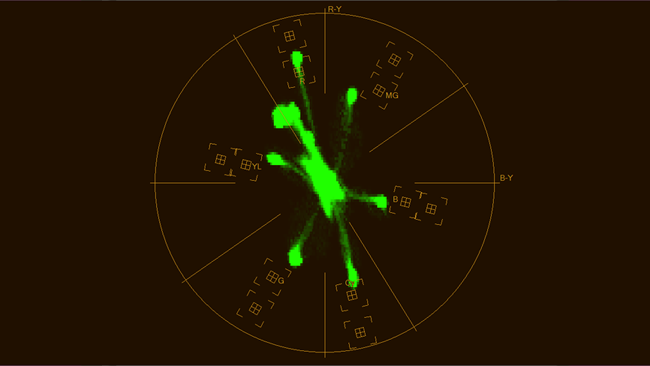 A vectorscope display of the chart as photographed by a Blackmagic Ursa Mini 4.6K,
with the Video recording mode selected.
In theory, if we shoot the OneShot chart on a (true) Rec. 709 camera, properly exposed and white-balanced, it should put a spot neatly in each box (with the scaling on the vectorscope set to 2, because of the 50% saturation print). This is the crucial difference between the OneShot and something like a Macbeth chart, properly an X-Rite ColorChecker. Macbeth charts aren't really designed with a vectorscope in mind and they create a display that looks like a random field of spots. X-Rite has since produced its ColorChecker Video, with more useful primary and secondary colours, but the classic chart remains popular. They're mainly useful because they're so widely used and there's such a wide understanding of what they should look like, but it's certainly easier to measure a OneShot chart using standard test and measurement equipment.
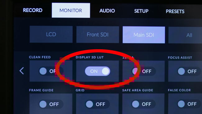 By default, switching on a display LUT on a Blackmagic Ursa Mini activates one that's probably designed to
make the camera look good on 709 monitors, which is normal practice.
In reality, the spots representing the chart colour patches almost never land in the boxes on the vectorscope. Reds are often oversaturated to make skin tones look richer and to warm up the picture. Bluish colours are often desaturated, with the cyan spot often being very far from the box it should be in, again in pursuit of a warmer image. Most produce a white with a day-ish colour temperature of about 6500K. This can look unpleasantly cold to viewers acclimatised to an indoor environment lit with 3200K tungsten. Not only does the camera matter, not only does the monitor matter, but the type of lighting the viewer was in just before they looked at the display matters, too.
These characteristics are certainly exhibited in the test image above, which shows that the Ursa's built-in 'Video' LUT desaturates blueish and greenish colours, while pushing the saturation of reds. It also swings both magenta and yellow hues towards red, which might make things look orangish overall, although there is, of course, no direct claim that this is specifically a '709' mode. The likelihood is that it's a mode designed to make the camera look good on 709 monitors, which is subjective.
 It's possible to bake the 709 LUT into recordings, for circumstances where material won't be graded.
The chart could be used during the creation of a custom LUT for this purpose.
Some cameras have true-709 modes which will put the dots in the boxes, but the resulting pictures are often not to modern tastes, looking cold, oversaturated and garish. The standard is old and tastes change, so we need to consider how the chart is best used in pursuit of more acceptable results. Reducing saturation will move the spot representing a colour toward the centre of the vectorscope, which represents completely desaturated colour. We can reduce saturation without affecting the hue, which would cause the spot to rotate around the vectorscope display, and it's often held that the spot should at least be on its vector (a line between the centre of the display and the target box).
There are things which are almost universally worth being careful about, such as the red-orange-yellow hues, which is where skin-tones reside. Proper use of the chart here can help guard against skin becoming sunburnt and purplish or yellow and jaundiced. Shooting with really low saturation in certain colours can create noise when an attempt is made to recover them in grading. And finally, the OneShot chart itself is a quick reference. Other charts in DSC's library offer not only primaries and secondaries, but also several hues in between, which should draw something approaching a hexagon of spots on a vectorscope display. This reveals problems with colours between the primaries and secondaries (orange, turquoise, etc), which may not be visible with the more limited chart, but that's probably something to deal with on a camera test and setup day, not really on set.
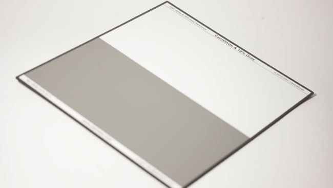 The reverse of the chart includes a straightforward white balancing area
and an 18% grey field which can be used for spot metering.
Factors affecting the things the OneShot chart measures can range from simple white balance, which will tend to slide the entire vectorscope display around, to playing with some of the advanced colour matrix features of broadcast news cameras. Particularly, it's a very useful chart when creating or evaluating the colour presets in things like DSLRs because it allows us to look at what the designer of the preset did and what effect it might have on various colours. These charts are also useful when grading, especially when creating lookup tables or at the initial stages of normalising a shot for a consistent starting point. That, really, is the purpose of test, measurement and standards per se: to know where we're starting from, even if we intend to deviate significantly from the norm later on. Although we've talked about opinion and fashion a lot, it's a good idea to know how a piece of equipment is likely to behave when we do various things with it.
Tags: Production

RedShark 2020 @ All rights reserved.

Comments