3 minute read
 A new look interface for the Ursas
Blackmagic's recent software update for the Ursa Mini features many welcome additions as the company seeks to balance power, complexity with usability.
Camera manufacturers are currently faced with a dilemma. Advances have made it possible to cram hitherto-unthinkable features into current cameras, while in addition normal commercial competition pushes designers to keep adding new things. However, the complexity of the resulting device risks it becoming more difficult to use, especially with single-camera production, where the simplicity of a film camera is widely admired.
Various manufacturers have handled this differently, although the historical approach has been split into the broad camps of live television and single-camera production, with the former leaning more towards a completely comprehensive feature set and the latter valuing simplicity. These factors apply to Blackmagic in an unusual way, because the company doesn't have a multi-decade history in either live or single-camera production, although it's on the way to establishing one.
As such, the design of the company's camera UIs has been fairly unique. Task-specific pages of yellow and grey iconography and text were always a welcome development, not only because of their simplicity, but because the features presented had been carefully selected to minimise the potential for confusion. On many cameras, it's easy to find oneself searching the menus for an unwanted automatic feature to disable.
 Blackmagic's traditional grey-and-yellow menus were straightforward,
but an expanding feature set demanded a new approach.
Not so with Blackmagic's products: they do as they're told and are deliberately uncomplicated. Blackmagic has never made cameras specifically aimed at people interested in casually recording a beach holiday; the recent firmware upgrades maintain this approach admirably. While new features are added, the Ursa Mini feature set didn't turn into a sea of options, which is more typical of more broadcast-oriented devices. The company considers two areas separately: the heads-up display that appears on screen during shooting and the menu system itself.
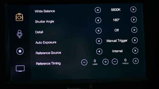
The HUD now displays principal camera status information: overlays, frame rate, shutter angle, the stop on an electronically-controlled lens, ISO and white balance, with the option to modify any of these by touching them. There's now an automatic white balance. There is an option to have an uncluttered image display, by shrinking the picture to leave room for the status displays, and the focus zoom can now slide around. The only significant missing feature is a waveform monitor. They're mathematically somewhat hard work to generate, but it'd be nice to see. An easier feature to implement might be a quicker way to toggle the viewing LUT on-and-off, which currently requires a trip to the menu.
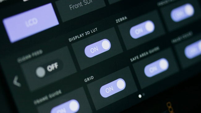 A 3D LUT can be selectively applied to the onboard TFT, front or rear SDI outputs.
Perhaps the biggest new feature is the 3D LUT capability, which is something of a surprise, but which sets the camera apart from some of its close competitors. Only one LUT may be used at once, but it can be selectively applied to the viewfinder or rear outputs, or the TFT. One particularly sensible addition is the 'clean feed' toggle, clearly intended for studio work or for use with external recorders, which prevents overlays (but not LUTs) appearing on the selected output. The zebra stripe exposure guides appear to be implemented before the LUT is imposed, so they continue to indicate real sensor exposure levels regardless of what the picture looks like. This is generally the right way to go for single-camera work, although approaches differ and growing studio applications might prefer the option to monitor the effective exposure of the post-LUT image.
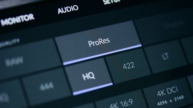 The large, rectangular buttons of the new design provide a large target for searching fingers.
As far as the menu itself goes, the principal change in layout, to a series of pages with big, rectangular buttons, is clear in the accompanying screenshots. In each case, the entire rectangular area responds to touch and it's therefore easy to hit the right spot. The interface is generally very responsive and options can be toggled at least as fast as it's physically possible to move a finger between the buttons. Options near the edge of the screen can suffer some tiny interference from the display bezel, hardly worth mentioning. The touchscreen on the Ursa Mini was always fast and responsive and this characteristic is maintained.
Updates to the viewfinder, which has always been a stellar point of interest on the Ursa, are also worth a quick mention. The proximity sensor on the viewfinder, which is intended to conserve the running time on the OLED display itself,was perhaps little trigger-happy, with a tendency to switch off the image at a critical moment. This has been addressed, possibly to the extent that it's now possible to end up with the image staying on long-term in certain hard-to-identify circumstances, but that's probably better than having it switch off in the middle of a once-a-century astronomical event, for instance.
Overall, the update is very welcome, not only because of the new features. The traditional grey-and-yellow menus represented a welcome degree of simplicity, but as the company's cameras have grown in complexity, the need for something more sophisticated has become obvious. This update answers that question nicely.
Tags: Production

RedShark 2020 @ All rights reserved.

Comments