4 minute read
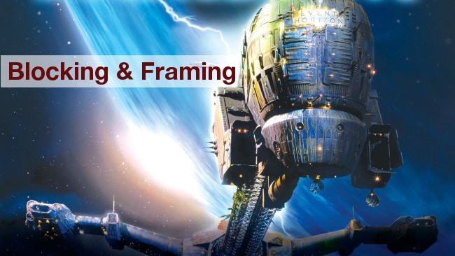
 Event Horizon
We take a look at some images and sequences from the sci-fi cult flick, Event Horizon, and find instructive points which may help your own productions.
The art and science of where to put the camera and the actors is something that people spend three years at film school trying to work out and a career trying to perfect. The experts at this sort of thing – the Ridley Scotts of the world – often have broad experience in commercials or music videos, which provide opportunities to learn fast and try a lot of different things very quickly. At the other end of the scale, we have the current infestation of broadcast television with cellphone video shot in portrait mode because, well, that's just the way you hold a cellphone.
And to be fair, it is. It's easy to unthinkingly default to the easiest-to-hold position with anything else, from a full-size cinema camera on a tripod to handycam-layout camcorders, where bright sunlight can make a flip-out display difficult to use and there's really only one way to handhold it where the viewfinder is accessible to the eye. The recent trend toward shooting handheld broadcast television from the hip rather than the shoulder is perhaps a reaction to a similar problem that exists with shoulder-mounted cameras; it's a recognition that we should not, in general, allow function to follow a happenstance of form, but it does require either a flip-out TFT or a loupe viewfinder that opens up.
Naturally, an interest in innovative blocking and framing should not be taken as a manifesto for complete chaos. Ill-judged attempts to avoid cliché can easily lead to disjointed and jarring compositions that seem more desperate than innovative. This is certainly a subject on which it's worth learning how to get it right before taking malevolent glee in getting it judiciously wrong, but the power of a compelling composition, adding interest to something that might otherwise be tedious, is tempting enough to encourage people to take risks.
Most people are aware of the basics. Fundamental camerawork is widely understood. In the interests of examining some more esoteric scenarios, then, let's stick a camera up Joely Richardson's nose:
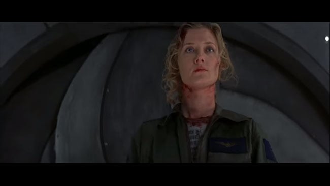
We'll be using a few examples from (and possibly spoiling) Event Horizon here, partly because it was shot by the late, great Adrian Biddle, BSC, but also because it's an absurdly underrated sci-fi horror movie that's worth a watch for the visuals alone – though not by anyone of a sensitive disposition or who's recently eaten. The choice of angle here is unorthodox: Joely's character is in a terrifying survival situation involving eldritch abominations from a parallel dimension, but the low angle puts her in a superior position to the audience, something that camerawork 101 would present as a way to make a character look powerful. But it's also intensely objective, isolating the character from the space she's in by hiding everything but the wall behind. Either way, it certainly isn't what you get by putting a viewfinder to where your eye happens to be without pondering the geometry of the situation first.
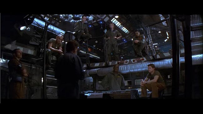
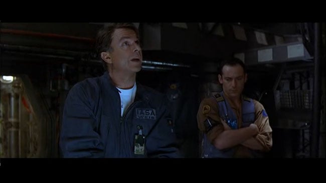
Now this, on the other hand, is what we call a composition. The trick here, if there's any trick, is partially in that the production has a nice split-level set so that they can shoot what's essentially a conference-table briefing scene without actually being so banal as to put everyone around a conference table. The details are important, though. The actors don't overlap one another or, at least, not much. Back and side light is used to separate them from the environment, although actually not as much as a less cautious hand might have applied, so the risk of everything looking like a TV movie is averted.
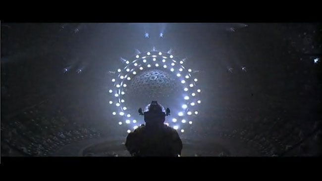
Naturally, the production design helps. The Lewis and Clark is TV Tropes' very image of a Cool Starship and there's all kinds of interesting detail and mixed colour temperature lighting. The environment is a masterful piece of work, given that movie was prepped in a couple of months, but regardless of the fine detail, it's a nice setup from a geometric point of view.
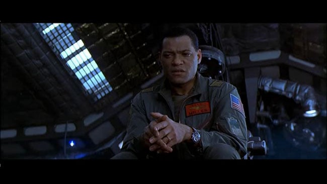
It does make the selection of coverage slightly more complicated. In the reverse angles, there can be a need to shoot high or low angles as appropriate, so that the eyelines of intercut conversation look reasonable, depending on whether different characters are above or below each other.
There are, of course, showy bits of composition in any film, but it's the combination of that and everything else that makes for something that looks really nice. Despite its rushed preparatory period, Event Horizon certainly does at least look really, really nice. Here's a technique that I think we can still call Dutch tilt, at some risk of causing offence to the inhabitants of the famously horizontal Netherlands.
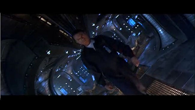
Several things are visible here, particularly the separation of foreground and background with warmer and cooler light. Biddle frequently uses the low, warmer light on the bridge set, possibly as a sort of photographic relief from the coldness of the rest of the movie, but this also stands as an example of the teal-and-orange trope. Event Horizon was released in 1997, possibly before the serious complaints started coming in that every movie was blue and orange. Although this choice of colours can be justified as a simple combination of human skin tone and its 180-degree hue opposite, it probably has its popular roots in the blueness of night as presented in Cameron's Terminator and earlier films.
But the degree of tilt here is extreme. The illuminated details in ceiling and floor (which use the warm tone of objects we're supposed to be more aware of) practically divide the frame down its diagonal. Event Horizon is a real anamorphic production with a wide 2.35:1 frame; a true diagonal would have put the camera practically on its side. It's difficult to credit every instance like this as an example of perfect set design intended specifically to facilitate this exact shot – it's more about the ability to recognise opportunities of this sort and exploit them. On the other hand, some things are a complete gift and clearly built to be so.
Naturally, Event Horizon, like all films, is also full of much more conventional pictures. It isn't necessary (or advisable) for entire sequences to be made up of this sort of thing; the results end up looking like a pretentious student film. Even so, while people are still shooting portrait-mode cellphone video, it seemed worth addressing the point. Regardless of the production design budget, something can often be gained by putting the camera in an interesting place and, grip gear notwithstanding, it's free.
Tags: Production

RedShark 2020 @ All rights reserved.

Comments