3 minute read
 Quirke
Color in TV dramas has never been more sophisticated
When you look at network TV dramas from the 70s and 80s, with all respect to the skills of the lighting creatives and production designers, color "look" was pretty hit or miss.
All you could do was select clothing and scenery to match the mood of the piece, but even then, you were very much at the mercy of the limited dynamic range and restricted color gamut of the video cameras. That was if it was a video production. Film was also used but would have still suffered in the conversion to video format for transmission - although a significant amount of what we know about color correction today came from the empirical science practiced by the telecine operators.
(Of course, before the 70s in Europe and the 60s in the US, there was no color. Imagine that!)
Flash forward to today, and we're watching stuff on our TVs that would simply have been unimaginable three decades ago. We might have predicted higher resolution (although probably over a longer timescale than it's actually taken - especially when you redraw the curve to take 4K into account), but would we necessarily have expected color rendition to be so good? Even if it is "only" Rec. 709, the international standard for HD TV.
Digital TV has brought a wider gamut and more consistent reproduction, especially when expressed through DVDs and Blu Ray, which generally have all the bandwidth they need, as opposed to Digital Terrestrial TV, which may have bright colors, but which can sometimes merely draw your attention to the big, blocky artifacts!
And now we have not just the prospect but the actuality of 4K. You only have to look at some of the TV set reviews to realize that these are some of the best televisions ever made. Which means viewers are going to expect another level of subtlety in the material they watch.
Well, that's how it might seem; that viewers want better color because they have better televisions, but the artistic reality is different to that, I suspect.
Because colour is such an intrinsic element of a production, that it can't just be given a "knob" that you can turn to increase or decrease it. Unless that knob was labeled "emotion".
The look of a production can have as much an effect as music or even the tone of the script. It sets the scene, literally. It can guide or enhance our emotional response to what we're seeing on the screen. Since we're normally in a state of suspended reality (some say it's similar to a hypnotic trance) when we're watching a film, it's not surprising that color can have a much deeper effect than merely stimulating our retinas.
Film directors have known this for a very long time but now we have the means to view their creations with near perfect accuracy, and the technology to capture almost any film-maker's vision for a look.
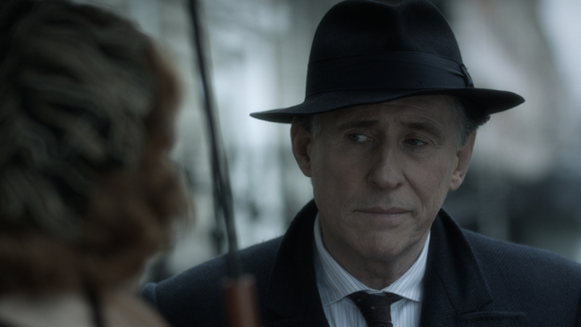
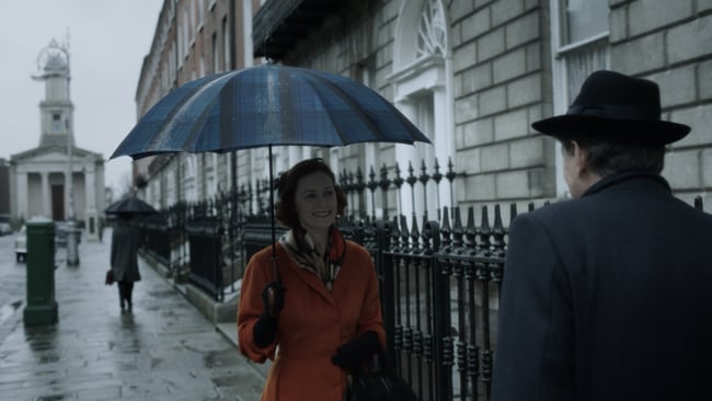
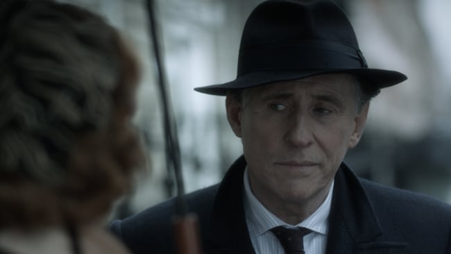
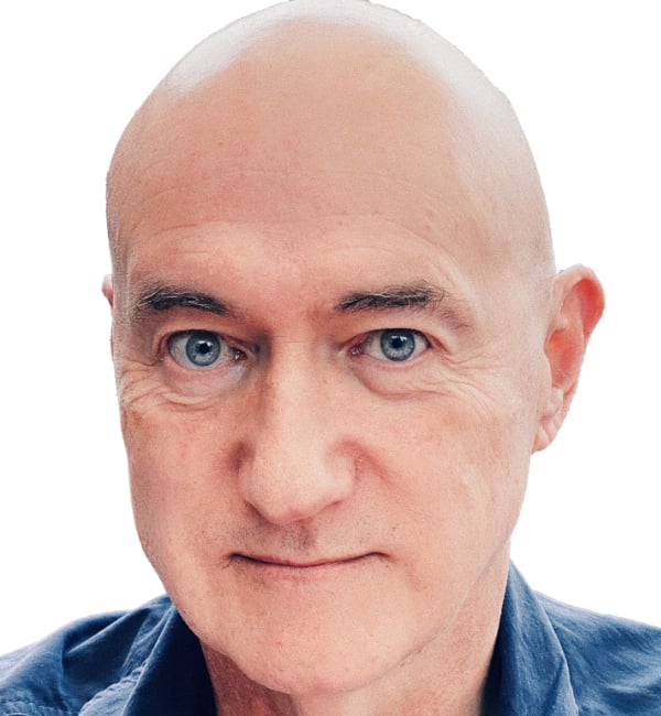
Here's an example. "Quirke" is a TV drama set in 1950s Ireland and Boston. It's about a pathologist who specializes in sudden death victims. It's been praised for its "film noir" look and it's high production values.
Color post specialists, the eponymously named "The Look", based in London, handled the color in Quirke.
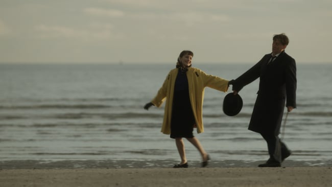
Thomas Urbye was the colorist for the first three episodes and was responsible for the heavy look, punctuated - as the script dictated - with bright colors.
"My brief from the series Producer, Lisa Osbourne, was to create a cohesive and cinematic look and feel across the three stories, while punctuating them with moments of strong color to accentuate particular characters and moods. for example, when the lead character Quirke hits the bottle in despair, I wanted to create a rugged, bleak look across the scenes. reflecting the difficult time he was going through. In contrast, Sara and Mal's house is opulent, with her bright orange dress standing out in all her scenes. "
Thomas uses The Look's Quantel Pablo Rio and praises its speed and sophistication. Quantel has always aimed at the high end and has the field of 4K color post production well covered.
As as each new generation of TVs presents viewers with ever wider gamuts, the work of the colorist is going to be an increasingly important factor in the success of almost every high-end TV production.
Tags: Production

RedShark 2020 @ All rights reserved.
Comments