4 minute read
 Presets are a good starting point to create effective titling
You don't have to be a master motion graphics guru in order to create effective, and importantly, thematically relevant looking titles for you videos. Here's how to approach graphical title design even if animation and typography isn't your primary skillset.
I’ve never been very good at making something from nothing. That statement rings true in my graphical work, and that is true for me in life. I say this because I’m sure a number of you reading this article can relate. As motion graphic designers, we don’t necessarily have to create these graphical elements from scratch. I’m a tinkerer by nature, taking a little bit of this and a little bit of that, combining elements and making something my own. Taking this into account, I’d like to open a dialogue about graphical theory and how you can create thematic undertones in your own works without pulling your hair out.
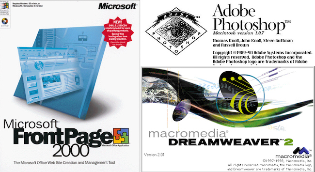
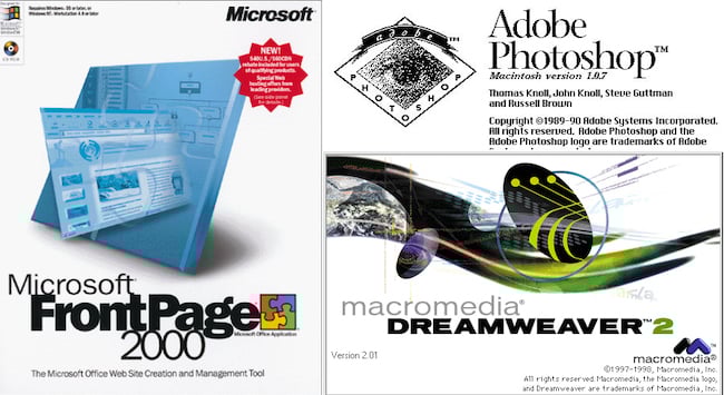
Throughout my career, I’ve been complimented on my motion graphic and design work, but, truth be told, I don’t believe there is anything special about my approach. Long before I became invested in film work, I was whipping up websites in my childhood room with programs like Microsoft Front Page or Dream Weaver and designing graphical elements in Paint or Legacy Photoshop. This allowed me to build a foundation on design, placement and typography. While I have no formal training on these elements, I have spent a great deal of time reading and watching content about the different principles of design.
At the beginning of my career in corporate commercial work, a lot of my designs called attention to themselves and I genuinely believe that to be a mistake. It wasn’t until I worked for a local web agency that I started to take more of a conservative approach with these designs, streamlining them with the products we were generating. My mentor really helped me “tone it down” and I think that’s what everyone can benefit from. It really all boils down to the type of film products you’re generating for your clients, as well as matching the tone of their own internal branding. As a rule of thumb “less is more”. In my own personal work, however, I am becoming a minimalist, but also the designs I do implement are becoming bolder.
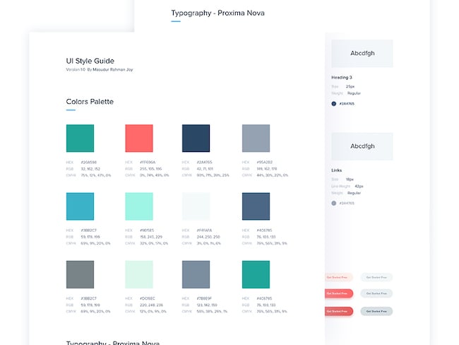
When devising how you’d like to integrate type font, lower thirds and other graphic elements such as logo animations or plates, make sure to request the company’s brand guidelines. This may seem like a “duh” to most, but I can’t tell you how many editors I’ve come across who purposely ignore these sheets to impose their own stylistic agendas. This doesn’t only clash with an established brand, breaking brand cohesion, but can also lead to wasted time, resulting in more revisions if the client is keyed off on your choices. If the client does not have an established PDF breakout sheet of their brand guidelines, make sure to ask what are some of their approved fonts, weights, and colour pallets they have used in the past with other works such as web or print. As a general guideline, I’ll spend about an hour sifting through a client’s outlets to get a sense of style before I dig into graphical work.
The theory behind design and motion graphics is to enhance a brand or product and leverage these designs to present information not conveyed in the visual or audible language of film. These elements can also serve as thematic undertones to prop up and assist in the visual motif of your work. With a lot of my passion work, I’ll traditionally use Video Co-Pilot’s Element 3D to pair weighted, three-dimensional fonts or design elements as a method to sell a packaged “look” or “feel”.
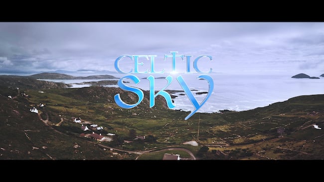
For instance, I traveled to Ireland and constructed an aerial video for a film festival. I wanted the title of the film to feel as if it was a part of the experience as we glide through the air, by pushing past it. I selected a Celtic themed font and brought it into Element 3D to extrude and apply a reflective surface to it. The title and the ending animations serve as “book ends” much like a hard cover and the smaller titling is in the same style to identify the geographical locations much like the chapters of a book.
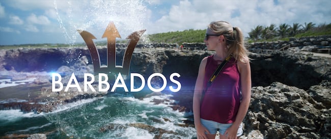
Similar to “Celtic Sky”, I wanted to create a visual motif that complimented the tropical nature of the island of Barbados. While the text is a plain white “Futura” type font, I reconstructed the Barbados national trident in Element 3D and integrated a variety of liquid animations paired with an elaborate sound design to give a very rich texture to the film. I knew I wanted to incorporate a water element and I could use such plug-ins like Trapcode Particular, but this can be time consuming. So I scoured one of my favourite outlets, VideoHive.net, and found a pack of liquid elements that had an alpha transparency. I layered these on top of my trident by resizing, rotating and combining multiple elements on top of one another. I also created a masking element that effectively wiped my trident away, combining it with water elements to give the illusion it was being sucked back into a water bubble.
For more conservative designs, I’ll usually try to match font types to their approved brand guidelines. Sometimes, I’ll play with the placement of fonts by stacking them on top of one another, shrinking the top font to “fit inside” the larger font underneath it along with some very subtle tracking and kerning. Rule of thirds and eye direction comes into play here as well. When I create motion titles, I might find a piece of footage that has some dead space to the image on one side or the other. I’ll then title the film and position it in that dead space. This does three things; it conveys a piece of information, it adds balance to an image, and it pulls the viewer in as their attention is demanded scanning the image from left to write.


Rule of Thirds can help you tell your audience where to look as well as have them scan an image from left to right.
With all of these resources being so accessible, you don’t necessarily need to be a master level graphic designer to accomplish a polished “look”. Before you add these elements, I believe you need to have a really deep understanding of the overall product you are trying to create as well as the information you must convey. When I sit down in the editing bay, I ask myself: “Does this need to be conveyed through motion graphics?”. You don’t necessarily want to slap graphics on your videos just because you can. On the opposite end of the spectrum, you need to identify and ask yourself: “Do these elements prop up, support and enhance the product I am creating?”. Lastly, you may ask yourself this question regarding the designs: “Do you think these graphics complement or detract from my principle photography?”.
Motion graphics can be very powerful and, with a bit of taste, can really make your products feel like a completed package. I’ll usually leave these elements for the end of my editing process, but as soon as I start to integrate them into my works, man, do these videos spring to life! In closing, everything in moderation, but don’t be afraid to add a flair of style to your work with some slick graphics if the product calls for it. Feel free to share your work, tips, resources and experiences with motion graphics in the comments section below.
Tags: Post & VFX

RedShark 2020 @ All rights reserved.

Comments