4 minute read
It pays to know what you are talking about! In our continuing series on basic colour correction, we decipher some of the most common terminology used in the grading suite.
Our previous articles in this series pertained to primary and secondary color correction. It’s also important to speak about the terminology used in the grading suite. Very often your customer has worked in other companies and grading suites so when he or she refers to a particular terminology, it’s important to know what they are referring to.
Prior to starting with your grading session you will have to conform your media. This can be done when you’re supplied with a file such as an XML, AAF or EDL file. When loaded into your system, they will rearrange your media in the order that was designated during the edit. The XML or Extensible Markup Language document is a comprehensive document that stores not only the media file location within the edit but in some cases grading and image size changes.
The AAF or Advanced Authoring Format works in a similar fashion to the XML file. It is primarily used with Avid Media Composer systems. Finally we come to the EDL or Edit Decision List file. This also reorganizes your media into the order as designated during the edit however is less comprehensive than the two prior formats. If you were to open either an XML or AAF file in a text application, you’d see very little information that you could identify with. If you were to open an EDL in a text application you’d see neatly rowed columns of timecodes showing edit in points and out points for your source and record media.
Once we get past conforming our media, we come next to the language used during grading.
First off you’ll hear about LUTs. LUTs otherwise known as Look Up Tables are available in two types known as 1D and 3D LUTs. The 1D LUT is a single channel look up table that traditionally only supports Gamma values whereby a 3D LUT using its’ three channels can support Red, Green and Blue values.
When a LUT is applied into the grading chain, a grading offset is added to the viewed image. Sometimes LUTs are applied to add a specific look or sometimes for calibration purposes. In these respects they are referred to as Look LUTs or Calibration LUTs.
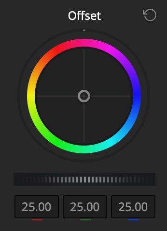
Offset / Printer Light Step Calibration
Frequently you might work with “old school” cinematographers who used to grade their films in film laboratories. Film grading during this time was done on a device that worked with the original negative and programmed Red, Green or Blue levels or Printer Lights. When the client asked for the image to be brighter, it would refer to a point or multiple points higher. When this would happen, the Red, Green and Blue controls would be brought up or down in unison to the desired level. If the picture was either too Red, Green or Blue, the corresponding control would then be adjusted. Many conventional grading systems still support this functionality.
For example in DaVinci Resolve you will find this control within the Primary Color Correction area. Since many film laboratories have closed, the requirement for this workflow has diminished so it was renamed Offset. However if you look at the User Preferences within Resolve you will see its’ original name, Printer Light Step Calibration. So with this in mind, if a cinematographer asks for the image to be two points darker, simply by toggling on these controls in the Primary Color Correction area will do the trick.
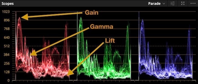
This now brings us to the primary color grading tools. The first is the Lift control. This control allows us to adjust the level of black in the image. The second is the Gamma control. The Gamma control can either expand or contract the midtone information in the image.
Adjustment of this control allows us to either compress the mid-tone details resulting in a darker and richer image or expand the setting resulting in a thinner or in some cases washed out image. I generally think of the Gamma control as my paint brush for creating a look in a scene. Using this control, I can create a denser or thinner image.
If I use the Gamma color control I can create the specific color look for the image.
Finally we move to the Gain control. This control adjusts the level for the light areas or luminance of the image. Within the area of primary color correction you will also find two terms, Hue and Saturation. The Hue control allows you to rotate the spectrum of color. For example if you have a red colored object in the picture and rotate to Hue control to the right the red object will become magenta.
Alternatively if you rotate the control to the left the red object will start to turn yellow. You can best see the effect of the Hue control by viewing the image on a vectorscope and adjusting the control. The Saturation control refers to the amount of saturation or color information in the image.
It’s also important to go over a terminology known as Color Temperature. This is effectively the color of the light. Light is measured on a color temperature scale known as Kelvin. The warmer the light source the lower the temperature and the cooler or bluer the light source the higher the color temperature. For example an incandescent light normally is 3200 degree Kelvin as it’s properties are quite warm whereas outdoors, the color temperature would be around 6500 Kelvin as the light color is cooler or bluer. Normally this is seen under the designation of 3200K or 6500K.
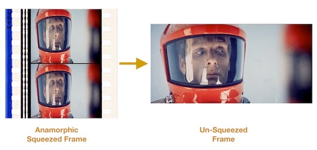
When referring to image sizes or Aspect Ratios, there are several terms that should be addressed. Very often you will hear about a “flat” version of a film. This is referring to a non-anamorphic version. When speaking about Anamorphic, the term refers to an image that is squeezed in any way during the initial shoot usually with the help of a special lens.
There are different degrees of squeezing the image. The most drastic is normally 2.35:1 squeeze that is referred to as either CinemaScope or Panavision. The CinemaScope process was the first used for this purpose developed by 20th Century Fox starting in the 1950s. It was developed from a process originally created in France in 1926 by inventor Henri Chrétien and called Hypergonar. With the introduction of Panavision optics, it was later renamed Panavision.
Prior to the arrival of high definition, wide screen or anamorphic films had to be reformatted when being adapted to a 4:3 aspect ratio of a television. This was normally done in the grading suite and called Pan and Scan. This was a process of repositioning and panning the image in order to fit it within the confines of the television screen.
The sizing information was programmed into the color grading system being used in the telecine suite. In later years the Pan and Scan process was abandoned and black borders were simply placed on the top and bottom of the image and this was referred to as Letterbox.
Tags: Post & VFX

RedShark 2020 @ All rights reserved.

Comments