4 minute read
Advertisement
It's 2024. Do we still need to obsessively calibrate our monitors, or are we pretty much always in the right ballpark nowadays?
Granted, monitor calibration devices were a must-have back in the days of CRT monitors and their ever-changing and questionable colors, but are these devices still needed in 2023 with modern monitors from the likes of Asus, Ben Q, Eizo, or even Apple’s Retina displays?
I come from a film background (Hasselblad and Nikon) and had my own black and white and Cibachrome darkroom. Back then, monitor calibrators didn’t come into the equation because we didn’t use monitors; we used chemicals and paper. As DSLR cameras slowly started to kill off the film camera and computer editing became the norm, monitor calibrators became necessary tools for professional photographers – at least the ones who took their colors seriously.
I must admit that when I first got into digital photography, I didn’t even consider monitor calibrators. I chose to rely on my eyes instead, but I did have a trick up my sleeve – now bear with me on this. Anybody who knows anything about audio recording studio techniques will totally get this. Any recording engineer worth their salt, be it a small home recording studio or Abbey Road, will have ‘test tracks’ (top quality recordings by top engineers recorded in the best studios) that they will drop onto an extra track on the timeline of say ProTools or Logic Pro to use as a reference for levels, compression, gate, reverb, delay, bass response, etc.
I also have a small home recording studio and do just this, but I do a similar thing with my photography when editing in my post-production software of choice, Capture One. I take high res images off the web that were taken by photographers who are at the top of their game – Karl Taylor, Rossella Vanon, Tina Eisen, Rankin, Luis Monteiro, and Tal Silverman, to name a few – and I drop them into new ‘Session’ in Capture One, where they remain as ‘Test Images’ that I can use to reference color, contrast/curves, skin tones, RGB levels of luminance, saturation and hue, for example, against any given image that I might be working on myself.
Obviously, these images were taken in different locations with different outdoor lighting and hues or with different strobes and modifiers to my own and with different cameras and lenses. Still, I’m not using these images to ‘color match’ or to copy and paste an analytical grade; I’m simply using them as a general ballpark because I know their images would have been graded and post-produced to perfection and seeing how they look on my monitor will give me a very good idea of how my images should look too. Again, this is only a small part of my post-processing technique, but it’s a useful reference that can help me get into the ballpark with certain images. I only use these reference images when I know the final image will only be viewed on a screen (laptop, mobile device, etc). For printing, it’s a different story altogether, with more calibration matching between monitor, printer, and paper required.
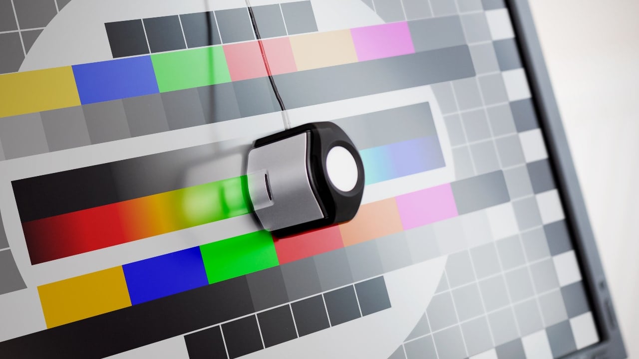
I own a 5K 27-inch iMac from 2017, and the built-in profiles are superb. The default iMac profile is excellent, as are the Adobe RGB (1998), Display P3, and sRGB IEC61966-2.1 profiles – all found in the System Settings under Displays. My recent experience of calibrating my iMac screen with a Display Pro HL device yielded questionable results. Following the instructions out of the box proved unsatisfactory – a heavy yellow color cast and a glazed milky look on my iMac’s Retina display. After speaking to somebody in the Calibrite tech team and following his advice with a few extra custom steps during the software calibration setup stage, I achieved a more accurate final screen calibration.
Compared to the standard iMac or Adobe RGB profiles, the resulting Calibrite profile (which is now available as a selectable color profile in my Mac’s System Settings/Displays) yielded a little more shadow detail being visible on the screen. However, the milky look, though reduced, remained, but this could be a trick of the mind due to the shadow detail being pulled out a little more. Maybe it’s an iMac thing, but to my eye, the new Calibrite profile seems lacking in contrast, the deep blacks are no more, the saturation is seriously lacking, and there is no punch whatsoever. Again, maybe Calibrate monitor calibration devices just don’t play well with iMacs.
I can’t make up my mind about this. Half of me says that if I use the standard iMac or Adobe RGB (1998) profiles, I might be inclined to pull the shadow detail out a little too much to compensate for the profile not revealing enough shadow detail. The other half says that if I use the Calibrite profile, I would probably want to crush those same shadows down a little instead. Intelligence tells me that I should edit with the Mac’s standard profile as, at least Mac users, this is what my audience will be viewing my images on and for those in Windows-land they will have similar Adobe RGB profiles on uncalibrated monitors too – so I’m editing for them.
This all brings me back to using ‘reference’ images during my post-processing work for comparison purposes and the fact that 99 percent (my best guess) of the masses that are viewing my images on the internet won’t be viewing them on calibrated monitors with the appropriate gamut coverage anyway so it could be argued that if I edit my images using my computer monitor’s default color profile everybody else will be seeing the same resulting image that I edited to, which begs the question, are monitor calibration devices really needed?
It’s also worth noting that, up to a point, you can rely on scopes, color temperature figures, RGB readings of luminance, hue, and saturation, and various other readouts that aid with your post-production work within any given software package, and these features are vital considering that even a well-calibrated high-budget monitor won’t compensate for the lighting in your room i.e., if you have an incandescent light on that is 3200K, and it is reflecting off a magnolia wall, your perception of color on the screen will look different. It’s just what the brain does, and if you don’t take a break every 10 minutes, the brain and eye will compensate even more, hence your eyes and brain are more likely to be inaccurate than your very expensive full gamut calibrated monitor.
I’m just saying we can take things too far, and I know I’d instead concentrate my energies on the ‘art’ of photography and creating images. As long as you’re in the ballpark's center circle, don’t overthink it.
Tags: Post & VFX
Written by Nigel Cooper
Advertisement
Advertisement
Advertisement
Advertisement
Advertisement
RedShark is a multiplatform online publication for anyone with an interest in moving image technology and craft. With over 50 contributors worldwide, full-time developers, editorial, sales and marketing staff, it is the go-to site for informed opinion and know-how for the quickly changing video, film and content creation industries.
RedShark 2020 @ All rights reserved.

Comments