3 minute read
Replay: If you are shooting for a monochrome look, you'd do well to pay attention to how colours are represented.
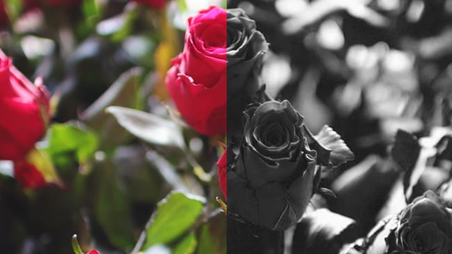
So you’re a landscape gardener and you’ve been asked to get involved in the reconstruction of a formal garden that hasn’t existed for decades. Happily, there are photographs of the garden from the 1920s which provide lots of useful information about what flowers were where, including a bed of spectacular black roses which form a centrepiece to the planting. OK, it’s a black and white photograph, so they could possibly be blue roses, maybe, or dark purple, but what they really look like is black. According to horticulturalists — and bear with me here — there is no such thing as a blue rose, or at least there wasn’t before the development of advanced genetic meddling. Natural roses appear in shades of red, yellow, orange and pink. So why do the photos of 1920s roses look black?
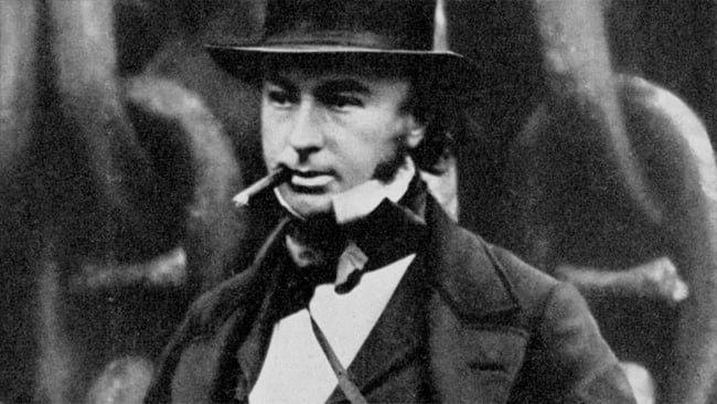
When we talked about the production of The Lighthouse recently, we used the word orthochromatic to describe film that can’t see red light (and can thus be handled under a red safelight in a darkroom). To most people, that’s all the term means – monochromatic film that can’t see red – but in fact, the very earliest photographic materials couldn’t see green, either. Orthochromatic film was developed as an improvement that made the film green-sensitive as well, with the “ortho” prefix originally intended to imply correctness or a realistic representation of reality.
Orthochromatic film could at least see green, but with no red it still wasn’t really a very accurate record of what a scene might be expected to look like in monochrome. Later, panchromatic black-and-white film was developed, which was sensitive to most visible light; it produces an image much more like what we’d expect to see if we simply shot on a modern camera and desaturated in post.
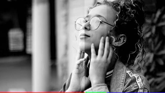
It’s from this that we get things like the bright yellow and red filters sometimes used by black and white photographers. In the digital age, it’s easy to overlook optical filtration, but it was a clear solution to people who wanted the flexibility of panchromatic film but noticed that their photos looked somehow different. Given how important red is to the rendering of human skin, this is a big deal. A photo taken of a 1920s debutante is likely to render her red lips as gothic black and it will also render those roses as much darker than they were in reality.
The option to get away from that is probably a good thing, but some people liked it and so someone came up with the idea of shooting panchromatic stock through a blue, or, more correctly, cyan filter – to exclude red light and return to the orthochromatic world of early 20s photography. From there it’s only a short step to the creative idea of shooting through a red filter, which is a particularly nice trick when we’re photographing a summer sky – the blue sky ends up almost black and the white clouds stay dramatically brighter.
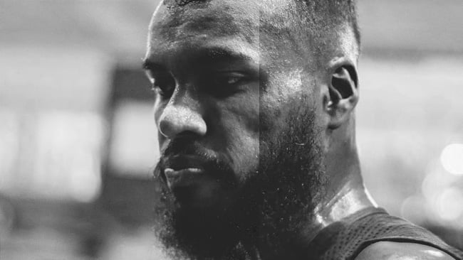
This becomes obvious if we look at the red, green, and blue channels of almost any image, especially if we view it as a greyscale image. Notice that the blue channel image immediately begins to show more skin texture and detail, in very broadly the same way that footage from The Lighthouse does.
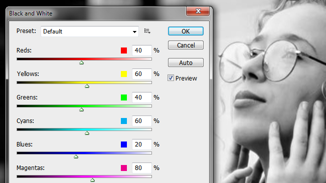
So, if we’re shooting for a monochrome image – as is not entirely uncommon for music videos and commercials – it emphatically does not mean that we don’t need to take any notice of colour. As should be clear by now, there are many, many reasonable monochromatic representations of a colour image. There are even different ways to get to a black and white image in one program; the default settings for the “black and white” filter in Photoshop do not create the same result as the “desaturate” command in at least some versions and there’s nothing wrong with that.
What this means is that creating monitor LUTs for shoots intended to be monochrome needs just as much attention to detail as anything else. The best approach will depend on the creative intent and the software at hand, but many people will define (some sort of) desaturation node, then apply colour grades under that until things look as intended.
That’s particularly relevant if we’re going for an orthochromatic look, since the blue channel on most electronic cameras has always had the poorest performance, given the relative insensitivity of silicon imagers to blue light and the wider spacing of the blue photosites compared to the green. On Bayer cameras, for good-looking monochrome, shoot extra-high resolution if at all possible, especially if the desired result is red-heavy or green-heavy.
Still, at least all this can be done in post, though beware of the vacillating senior creative who might begin to lack moral fibre rather late in the process and reverse the decision. Perhaps ideally, we could shoot film or the monochrome Epic with the same colour filters that would have been used almost a century ago. The decision is made and the roses, no matter what anyone says, will always look black.
Tags: Production

RedShark 2020 @ All rights reserved.

Comments