
3 minute read
The Lighthouse, starring Willem Dafoe, takes what we traditionally consider to be 'cinematic' and totally redefines what we might consider it to be.
Most of the people reading this will at some point have concerned themselves with making an image look – and this is such a weasel term it’s tough to use with a straight face – cinematic. In doing that, most of us will instinctively reach for the basic trappings of conventional cinema, things like aspect ratio, colour rendition and the blemish-free depicture of actors.
Somehow, the trailer for director Robert Eggers’ The Lighthouse is managing to trend on YouTube while having taken a quite unusual, if not directly contrarian approach to several of those things. Is it possible that some of the current popular and instinctive choices about cinema images are – well – wrong, or at least far from universal? The phrase “currently popular” is chosen carefully there, because director of photography Jarin Blaschke has taken an approach for The Lighthouse which refers to some of the earliest, most fundamental notions of photography, let alone cinematography.
It’s easy, for instance, to choose to shoot something in black and white. High resolution modern cameras make it easy to shoot colour then make careful choices about which aspects of that colour make it into a monochrome final image, but Blaschke didn’t do that; he apparently evaluated the options and eventually shot the production on Double-X, Kodak’s mid-century orthochromatic negative stock.
This is quite literally the formulation that was used on Raging Bull and Schindler’s List. With Blascke’s filters it had an effective ISO of 80 (the box says 250 in daylight and 200 in tungsten, but it’s often pulled or pushed for a different look.) Kodak describes 5222 as “high speed,” though that may only really be valid in the context of its 1959 introduction. Stills people regularly shoot double-X and develop it with effective sensitivity anywhere up to 3200 ISO, though the grain performance at that point might be (and let’s be nice) highly artistic for motion picture purposes.
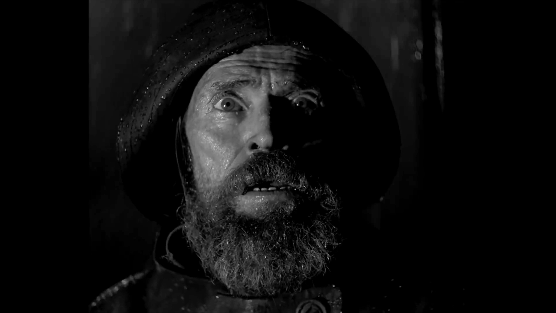
Terms like “orthochromatic” are often not well understood. Simply put, the reason that a red safelight works in a black and white darkroom, at least while handling photographic paper for prints, is that early monochrome films (and modern photographic paper) can only see blue light. Nobody makes orthochromatic film any more because human beings are largely defined by the colour of their blood, though black and white paper is invariably orthochromatic so that a safelight works, and a conventional enlarger protocol is possible. Blaschke, though, wanted an orthochromatic look, which he simulated using blue filters. The upshot of this is an emphasis on the texture and colour variations in people’s skin – often the last thing we want in commercially-minded types of photography, but wonderful for a story about people living in a big stone tower on a remote promintory in New England.
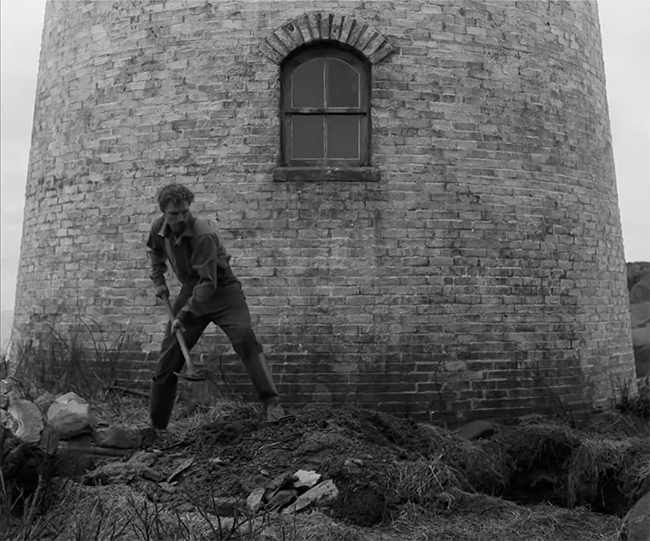
It’s easy to assume that The Lighthouse has been shot in the roughly 4:3 aspect ratio of early twentieth century film. While we’re talking about this, it’s as well to be accurate: on paper, after the advent of optical sound, films theoretically had an aspect ratio of 1.375:1, which is microscopically wider than a 4:3 TV screen. The difference would probably be made up in the cropping and masking that usually happens in 35mm projection (sorry, operators, but projectionists know it’s true.)
The Lighthouse, though, wasn’t shot in 1.33:1 or 1.375:1; it was shot in 1.19:1. If anyone’s heard of someone shooting anything approaching a major motion picture in any format that’s squarer than that, let us know in the comments. The famous example of it is M, directed in 1931 by Fritz Lang; other well-known productions include the 1927 Sunrise: A Song Of Two Humans and Hallelujah, from 1929. The aspect ratio was associated with Fox’s Movietone system, a contemporary of the famous Vitaphone, and was in use only for a few years during the transition to synchronised sound; The Lighthouse is likely to be the first (major) film to have used it in ninety years or so.
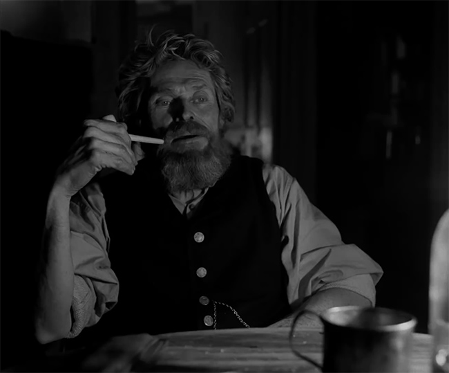
In an interview for Kodak, Blaschke describes digging a set of 1930s Baltar lenses out of a back room at Panavision. Lenses that old tend to flare. Double-X also tends to flare because it has a slightly different anti-reflection arrangement, where light may pass through the film and bounces off the back layers or metalwork in the gate. Some camera – often Bolexes, for some reason – have black-plated metalwork to reduce the problem, though other cameras prefer harder-wearing plain metal finishes.
The Lighthouse is, of course, a tour de force of production design and lighting, and of adventurous performances by Willem Dafoe and Robert Pattinson, none of which should be overlooked in the pursuit of pretty pictures because, as we’ll keep saying, filmmaking is a team sport. In the end, not every production can or should be shot in high-contrast, pseudo-orthochromatic black and white, but in the end, most people will be quite happy that every so often someone will do it, and even happier that it ends up looking like this.
Tags: Production

RedShark 2020 @ All rights reserved.

Comments