2 minute read

Lighting design engineers have been illuminating things with magic glowing powders for at least eighty years. But blue is still a tricky colour with modern LEDs.
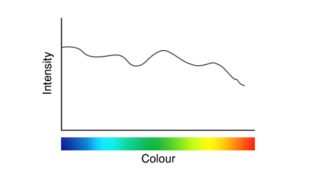
Anyone who’s got beyond the surface layers of LED lighting in the last ten years will recognise the graph that follows. Whether we think of it as a wobbly line of woe or a testament to the vastly improved technology that’s now lighting up the world, it’s recognisable as the output of a white-emitting (or approximately white-emitting) LED.
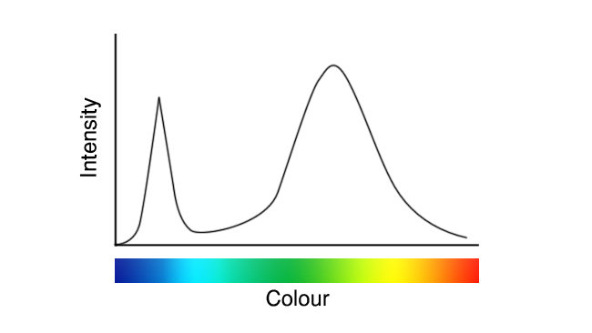
These images are deliberately idealised examples, to avoid the impression that we’re seeking to promote or criticise anyone in particular, but they represent roughly what white LEDs have looked like since their inception. Recently, though, we’ve seen a few that looked more like this:
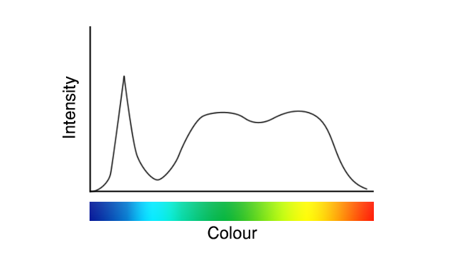
See the difference? On a couple of occasions, that’s been the difference between a TLCI in the 90s, and a TLCI in the high nineties (discussions of which figure of merit we prefer for white light will have to wait for another day.) It’s imperfect – look at that valley in the cyan – but it’s better.
It’s not completely clear what’s going on here, because the details are likely to be considered trade secrets by the companies making these LEDs. Presumably, though, that the difference is in the phosphor coatings, which were traditionally intended to produce yellow light on the basis that the yellow phosphor would combine with the blue output of the LED to approximate white. That’s what we see in the first graph above and it notoriously suffers reduced output in deep blue, cyan and red.
We might reasonably speculate that the new approach, in the second graph, uses a blend of two phosphors emitting red and green, or at least greenish-yellow and reddish-yellow. That helps with reds, because the red phosphor is deeper and wider than the old yellow phosphor, and it helps close up the gap in the cyan a little thanks to the wider green.
It doesn’t do much about the deficiency in deep blue. The process by which phosphors change the colour of light is called a Stokes shift, and it can only go one way – redder. We usually associate fluorescence with ultraviolet or blue light, but aim a green laser pointer at a dayglo orange object and it’ll become clear that it’s just as possible to shift green to orange. What we can’t do is shift orange to green, or more to the point blue to deeper blue. Bluer means higher frequency which means higher energy, and shifting lower energy photons to higher energy ones therefore means more energy coming out than goes in, violating the laws of thermodynamics.
And yes, it’s the blue that remains a problem even in the improved LED. What we’d like to do is to use a phosphor for the blue as well as the red and green, but that would mean a deeper-than-blue LED to drive it. Light of a colour that’s deeper than blue is usually called ultraviolet, and while UV-emitting LEDs do exist they haven’t historically lasted very long or been very bright. Or, well – powerful; it’s hard to describe an invisible light as “bright.”
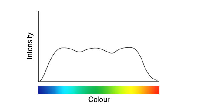
That’s perhaps on the cusp of changing, though, and perhaps one day reasonably soon we might see lights that look more like this, with phosphors creating the red, green and blue output.
If your instinct is to complain that’s still not ideal, though, let’s end on a painful truth: even daylight isn’t a flat line, either.
Tags: Production

RedShark 2020 @ All rights reserved.

Comments