4 minute read
Colour gamut charts are often bandied about as a way of showing how well a monitor or light performs. But the story behind them is complex, and not at all straightforward.
Anyone who's calibrated a monitor or analysed a light source will have encountered one of these:

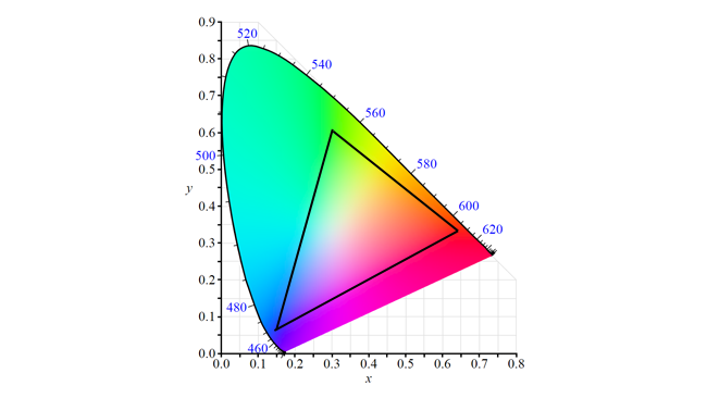
It's pretty widely understood that this is a “CIE 1931 colour space chromaticity diagram”, representing all the colours visible to humans at a given brightness and that white is somewhere in the middle of the coloured area. That works as a widely-recognised way of discussing colour.
It's a confusing chart, though. The shapes are irregular and don't follow any obvious pattern. The axes are labelled “x” and “y” which don't seem to have anything obviously to do with colour. The vertical axis seems to run from blue to a sort of slightly yellowish-green, the horizontal axis runs from a greenish-cyan to red, roughly, with lots of distortion. We're used to seeing colour represented as cubes in an RGB colour model or perhaps as a cylinder, as in a hue, saturation and luminance model, but the CIE 1931 diagram is a strange beast.
One way to think about this is that it's sort of reminiscent of a colour wheel, the sort of thing we get in software like Gimp or the hue wheel in Photoshop when selecting colours:
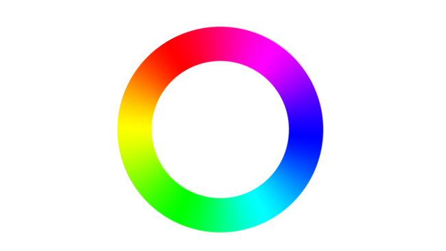
Mathematically, CIE 1931 isn't really a hue wheel, but that's roughly the result we get. It's irregular because it's based on assessments of real humans. The three types of colour receptor in the human eye overlap a lot, meaning that we can differentiate certain colours more easily than others. If those receptors were more evenly spaced with exactly the same completely ideal, completely consistent response to coloured light, then the colour patch might have a more regular shape.
The actual mathematics were developed so that colour would be represented in two numbers – the x and y of the CIE 1931 diagram, while luminance, Y, would be represented by the third dimension going through the chart at right angles to your screen. This is very much like the way component (often called YUV) colour encoding works. Component video is done that way so we can separate out the colour and store it at a lower resolution. The CIE 1931 diagram does it so we can consider colour independently from brightness.
There was also no intention to make the representation of hues look like a circle, which is why the red and blue ends don't join up. There's really no reason why they should if we think about it. Red and blue are not in any sense next to one another on the actual visual spectrum. They're at opposite ends of it. The magenta colours between red and blue, as with all the colours that aren't on the curved edge of the horseshoe, are just mixtures of red and blue. The concept of “magenta” is something that's entirely made up by the human visual system when it receives both red and blue light simultaneously. There's no such thing as monochromatic magenta light.
So, that horseshoe shape is essentially traced out by the perceived colour response of the human eye to completely monochromatic light. It's an irregular shape and it doesn't fill the square shape of the graph because it's not a graph of colour, it's a graph of human response to colour.
It's true that any two colours anywhere on the CIE 1931 diagram can be mixed to create any colour on a line between them, just as with red and blue to create magenta. But notice that the true 100% magenta looks like it's much nearer the blue than the red. Likewise, mixing equal parts of any two colours on a CIE 1931 diagram will (usually) not create the colour at the midpoint of the line between them. This is because the CIE 1931 diagram is very non-linear. This makes some problems look worse or better than they really are. Consider the Rec. 709 colourspace:

In the same way that any of two colours can be mixed to create any colour on the line between them, any of three can be mixed to create any colour inside the triangle. CIE 1931 makes Rec. 709 look really terrible at covering green and green-blue colours since there's a huge amount of colours that our eyes can see that aren't inside the triangle. In reality, that is true, but it isn't quite as bad as CIE 1931 makes it look.
This problem was revealed by some work done by David MacAdam in the 1930s. His work involved figuring out how different two colours had to be before the average human could tell them apart. If we take a single reference colour somewhere on a CIE 1931 diagram and then show a group of humans a series of very similar but non-identical colours, we could draw a line enclosing all of the colours that the humans couldn't tell apart from the reference. We'd expect to get a circle, like this:
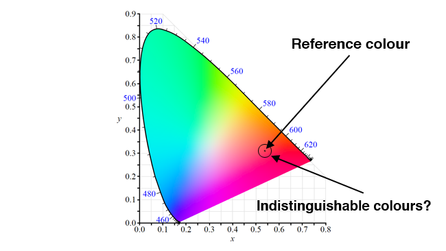
Unfortunately, that's not quite what we get.
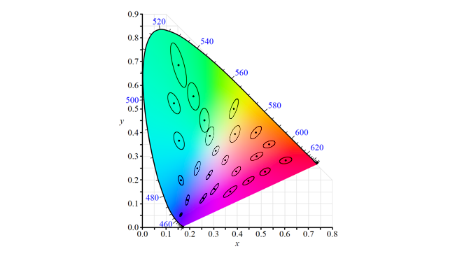
These ellipses are blown up to ten times their actual size, for visibility, but the problem is clear – if we take a greenish yellow and shift it a little way towards the red, people will see that difference very quickly because the ellipse is narrow in that direction. If we shift that same greenish-yellow colour towards the blue, we can move it a lot further before the human observer will see it because the ellipse is longer in that direction.
Recognising this, the CIE issued updates in 1960, 1964 and 1976. The colour space resulting from the 1976 work, CIELUV, was titled the “uniform chromaticity scale” and is plotted in u' and v'. It's similar to the 1931 diagram but set up so that a distance on the diagram is a better representation of how different a colour looks to humans. It's still not perfect, but it's better.
For some reason, everyone still uses the 1931 chart.
Technical illustrations supporting this article are based in part on work generously placed in the public domain by Wikipedia users BenRG and Adoniscik.
By BenRG - File:CIExy1931.svg, Public Domain, https://commons.wikimedia.org/w/index.php?curid=7889658
By Adoniscik – File:CIE 1976 UCS.png, Public Domain, https://commons.wikimedia.org/w/index.php?curid=3770098
Tags: Production

RedShark 2020 @ All rights reserved.

Comments