
4 minute read
Replay: How you frame your characters will enhance or take away from the storyline as much as any scripted narrative. Straying away from traditional rules of composition can enhance your visual storytelling immensely.
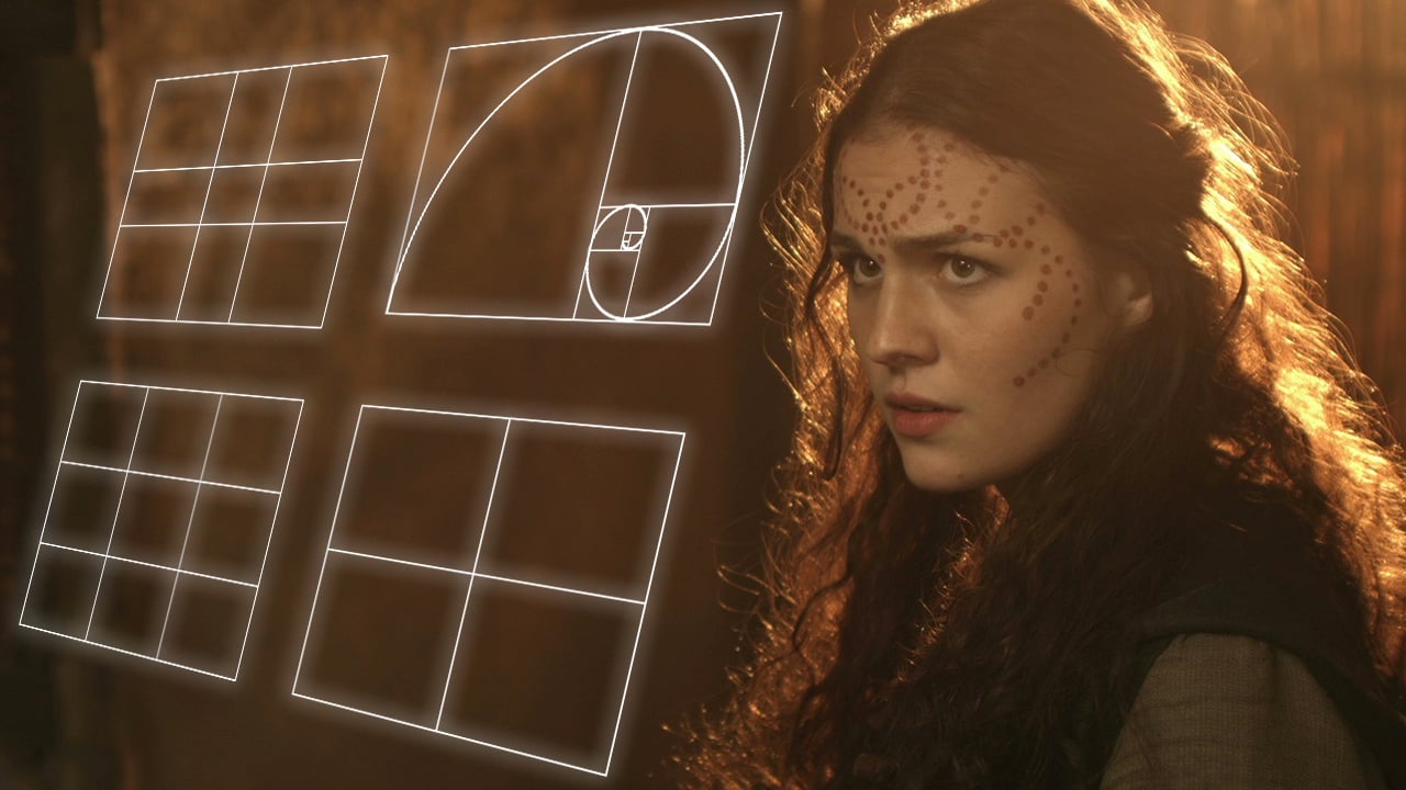
When we first start composing images, we are taught several rules: don’t put the subject in the centre, give them space on the side of the frame they’re looking towards, put the top frame-line just above their head. But rules are made to be broken and in this article, I’ll look at some of the reasons why unconventional framing might be the right choice.
If a character is looking screen-left, certainly it’s most common to place them on the right of the frame – giving them lead room (a.k.a. nose room or looking space) on the left, but that is not the only option. In certain situations, it’s more appropriate, or simply more aesthetically pleasing, to place them on the left or in the centre. And although The Rule of Thirds suggests how far to the left or right they will commonly be placed (a third, or two-thirds of the way across the frame) it is, again, far from the only option.
Sticking with the example of a close-up of a character looking screen-left, let’s imagine that you place them to the extreme right of the frame, further over than the Rule of Thirds dictates. This character becomes someone backed into a corner, isolated. They have full cognisance of their situation – they can see it all in front of them. What you choose to place on the other side of the frame is very important with an extreme composition like this. Negative space creates an unbalanced frame, suggesting someone in a precarious situation, whereas another person or object would appear to dominate the subject.
Now imagine that same left-looking character framed to the left of centre. This flies in the face of received wisdom and is known as short-siding. The effect of this varies depending on the degree to which it is done.
Placed just a little left of centre, the character would still have some lead room, in fact, an amount of lead room that would be perfectly normal in a 4:3 composition. Personally, I would be comfortable with this composition for purely aesthetic reasons, but it could also be used to create some visual tension, suggesting things unknown behind the subject, waiting to creep up on them figuratively or literally. It could also suggest the character is weak, particularly if intercut with another character who is more traditionally framed.
As you place your left-looking subject closer and closer to the left (“wrong”) side of the frame, the image feels increasingly uncomfortable. A character severely short-sided may seem unbalanced, lost, trapped, wrong-footed or isolated. Or they might simply be deep in thought; perhaps another character is about to enter in the background (frame right), breaking the reverie, restoring the compositional balance and turning it into a deep two-shot.
The Amazon series Mr Robot sometimes places Elliot, the mentally ill lead character, right up against the “wrong” side of the frame. Imagine someone walking into a room and standing right up against the wall, facing it. You would think them strange, disturbed. You might wonder if they were looking at something imaginary. This is the effect created by extreme short-siding. It also serves to make the subject look completely alone, even though they might be speaking to someone just inches in front of them.
Dead-central framing can create some interesting effects as well. Firstly, it can be used simply for impact. If used judiciously it can give a character their moment in the spotlight, putting them centre stage. It can underline a key character- or story-beat. Or it can give a subject tremendous power and dominance, particularly in combination with a low angle.
When you surround a character with equal amounts of the background on both sides, it can also seem to embed them into that background, creating a strong connection between them and their environment.
Stanley Kubrick used central framing with strong single-point perspective to create worlds of perfect order. The formality of the symmetry can suggest rigidity, trapping the subject. Conversely, central framing can enhance the humour and goofiness of a scene, as frequently demonstrated in the films of Wes Anderson.
When you shoot a shot-reverse with both parties centred, the two characters appear to replace each other on the screen every time you cut. This can suggest a strong connection between the characters or a strong conflict as they battle for the same piece of screen. Donnie Darko uses this technique to set up the antagonism of the rabbit, while also suggesting he’s a part of Donnie, a figment of his imagination.
Headroom is another aspect of framing which should not be taken for granted. In fact, the concept of placing the top frame-line just above the subject’s head is a fairly recent one in the context of art history. Take a stroll around a gallery of classical paintings and you will see a great deal of headroom on display.
In the Polish indie feature Ida, winner of the 2015 Best Foreign Language Film Oscar, plentiful headroom is a symbol of faith. The lead character – a nun – is constantly seen low down in the frame, suggesting heaven above her. A sense of helplessness is conveyed, of free will being overcome by larger forces above and around Ida.
In the ITV crime drama Broadchurch, David Tennant’s DI Alec Hardy complains of the small coastal town’s “endless sky”. This observation could equally apply to the cinematography, framing the action as it often does with expansive headroom. While this may be partly an attempt to emphasise the isolation of the titular town, where people are small in the face of nature, its primary effect is to evoke the secrecy so integral to the storyline. Just as the police – and viewers – are figuratively misdirected by the suspects’ lies, so the camera is literally misdirected. The message from the cinematography is: look at the beautiful sky and the paintings high up on the wall because if you look too hard at what’s in front of you, you’ll see that the surface perfection of the bucket-and-spade idyll is built on foundations of sand.
The Channel 4 conspiracy thriller Utopia also employed excess headroom. Characters were frequently crushed into the lower half of the frame, a symbol of the powerful conspiracy looming over them. In fact, Utopia broke many rules, using a 2.39:1 ratio unprecedented in a TV series at the time, along with a garish, digitally manipulated palette and obtrusive lens flares. Like Mr Robot and Broadchurch, it’s an excellent example of how breaking the conventions of cinematography can keep the viewer on edge, leading them to question everything.
So, next time you watch a film or a TV show, pay attention to the framing. You may be surprised to find that non-standard compositions are employed more often than you thought.
Tags: Production

RedShark 2020 @ All rights reserved.
Comments