3 minute read
Advertisement
Replay: Digital colour grading has been an integral part of the cinema process since “O Brother Where Art Thou?” was released in 2000. Why then are so many modern films so flat?
Perhaps it's due to the increasing public understanding of filmmaking, or perhaps it's because there's forever going to be a need for YouTube auteurs to keep posting material, but there seems to have been an enormous amount of criticism of colour grading recently. When we looked at a piece talking about Man of Steel, the question was raised that the before-and-after material had been dressed up more than a warmonger's intelligence dossier, but that wasn't the only example. Even if you don't agree that Man of Steel was far gloomier than any really faithful interpretation of its comic-book origins deserved to be, Marvel's movies have been the target of similar commentary.
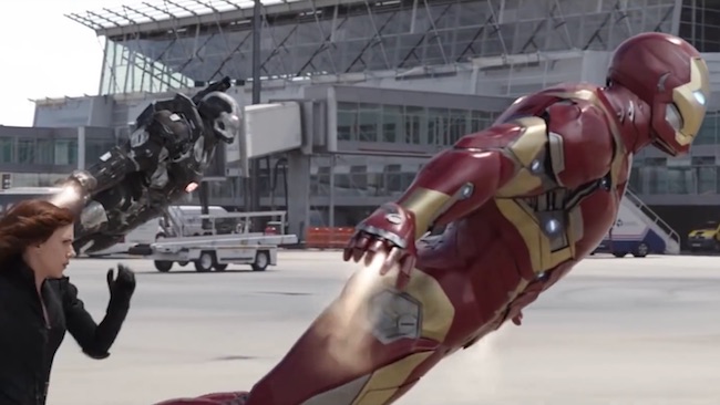
Even before the comic book era, there was much mirth over various tongue-in-cheek assemblies of material demonstrating the endemic use of teal and orange colour schemes. At the end of last year, YouTuber Patrick Willems published a video which discussed the idea that many of Marvel's movies are “kind of ugly,” itself based on some of the grading choices made.
As with so much film criticism, it's interesting and informative even if you don't agree with Willems' ideas, and ultimately it's just the latest in a line of these things, but he makes an interesting point. The Marvel movies do look a bit bland, even if he's possibly making a mistake about studio and full-swing signals when he says there are no true black levels. There's an argument that they lack contrast. What's going on in grading at the moment? Well, probably three or four different things.
Part of it is technology, but probably not much of it. Films like Fincher's Seven went to enormous lengths to control the way the image looked in the days before digital intermediates. It's always been possible to make things look odd enough for the audience to notice, whether that attention is positive or negative. Incidentally, Willems dates the concept of grading, inaccurately, to the invention of digital intermediates for cinema release.
Of course, it had been a factor more or less since telecines were equipped with video processing amplifiers, and arguably even the practice of setting printer lights, called colour timing, was a form of grading. The thing is, none of this really explains why massively improved facilities should lead to work that's more widely subject to query when the opposite ought really to be true.
Part of it are the productions in question. Every nut, bolt and eyelash hair in a Marvel movie will have been focus-grouped twice before the movie went anywhere near a commercial release. Sometimes it's possible for the large companies who make these sorts of films to make serious mistakes in their application of statistics, ask the wrong questions, get the wrong answers and enthusiastically seize the wrong end of the stick. It seems unlikely that a focus group would vote for flatter, blander pictures, although they might.
The capacity of the lay filmgoer to complain about any aspect of a film they're specifically asked to concentrate on should not be underestimated, and the conservatism of producers who are responsible for a nine-figure budget is understandable. So, part of it may be a choice entirely outside the hands of the colourist or the director of photography.
But yes, still, part of it is colourists. Like more or less every job in the entire film industry, no formal qualifications are required to be a colourist and any assessment is entirely subjective. The fashion for material which looks as if it's been shot in log and broadcast unprocessed almost certainly started as a result of a colourist doing exactly that out of sheer ignorance, so let's not overlook the possibility that people complain about the look of these films because the person who graded them simply had some very odd ideas. The emperor's clothes are absolutely brand-new in the field of movie grading. OK, even within these limitations, making a big feature film look consistently like anything, regardless of what that thing is, is difficult enough. There are many very clever people out there doing very good work, but it is all a matter of opinion.
Marvel, at least, seems to be going for a certain consistency, but there's an irony to the situation: having struggled for decades to produce video cameras with high dynamic range, we're now struggling with images which look too flat.
Tags: Production

Written by Phil Rhodes
Advertisement
Advertisement
Advertisement
Advertisement
Advertisement
RedShark is a multiplatform online publication for anyone with an interest in moving image technology and craft. With over 50 contributors worldwide, full-time developers, editorial, sales and marketing staff, it is the go-to site for informed opinion and know-how for the quickly changing video, film and content creation industries.
RedShark 2020 @ All rights reserved.

Comments