2 minute read
Advertisement
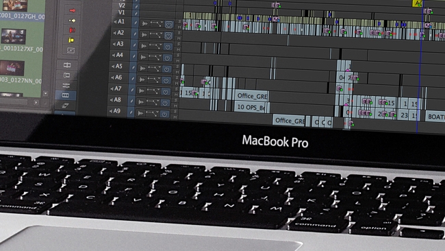
Replay: Why interface design for today's editing software seems to lag in innovation.
The trap is that is that so many people use your software - and have invested time in learning it - that you can't upgrade it as much as you'd like to, because you would 'break' people's automatic, finger-memory knowledge of it.
With the graphics capability of modern computers, there's no reason why NLEs shouldn't have amazing, slick, fluidly moving 3D interfaces, like even the cheapest games consoles.
You can quite understand users not wanting to be dazzled, exhilarated or even nauseated by a user interface that shifts and moulds to every little input.
But you might wonder whether users might want things to look a little more (ahem) up to date?
I guess there's another problem here, which is that, to a large degree, if you make an iconic software product, then the look of your user interface is as much your brand as your logo.
Look at the number of TV documentaries that, stumped for a good location to shoot, choose to interview in an edit suite. And you always know when they're using Avid: you can spot that chunky interface from a mile off.
Now, I strongly believe that if a product works, then it's perfectly OK to leave it alone. Look at the piano keyboard. Wouldn't it be a mess if they introduced blue notes in between the white and the black keys?
One of my favourite pieces of software ever was the catchily named "Voyetra Sequencer Plus Gold', which ran under MS DOS. That's right - it had an entirely ASCII interface - that nevertheless managed to mock-up a piano-roll type timeline and, actually, be extremely quick and efficient. So much so that I've never liked any MIDI software as much since. Except Reason. Oh, and Ableton. Oh, and a few others. But it was, for its time, extremely good to use, on a 286 computer!
Mixing consoles have changed internally beyond recognition. Even to the extent that they mostly don't even carry audio any more. Instead, they're just slick controllers for a box of DSP that sits somewhere else in the building, away from the tranquility of the studio control room. But they're still visibly similar to their old, analogue forebears.
And computer keyboards - the most basic user interface for a PC or Mac - still have the bizarre but universally accepted (except in France) QWERTY layout.
Some NLEs have tried to be different. Sony Vegas, which continues to evolve, has always had more of a 'drag-and-drop' feel to it. Premier has been through many iterations and has now landed on a theme that seems consistent and highly usable.
Avid has never really changed its appearance fundamentally, but that doesn't stop it being - indeed maybe helps it to be - a top NLE.
Of course, it's always important to modernise software. This has to happen, otherwise there would be no 4K, no LUTS, no HDR and no new ways of working at all. But unless you're launching a completely new piece of software, that works in a different way (and good luck if you do!), then you probably don't need to change the interface so much as to break all the deeply learned responses to it.
Tags: Post & VFX

Written by David Shapton
Advertisement
Advertisement
Advertisement
Advertisement
Advertisement
RedShark is a multiplatform online publication for anyone with an interest in moving image technology and craft. With over 50 contributors worldwide, full-time developers, editorial, sales and marketing staff, it is the go-to site for informed opinion and know-how for the quickly changing video, film and content creation industries.
RedShark 2020 @ All rights reserved.

Comments