5 minute read
The 24th March marked the 20th anniversary of the release of Mac OS X, an operating system that helped change the face of Apple.
Graphical user interfaces for computers were nothing new in 2001, the year of the OS X “Cheetah” release, but it’s fair to say that they were pretty utilitarian in their design. From the original Windows, which was released in 1983 to classic Mac OS, which first released in 1984 with System 1, the idea of a computer OS being designed such that it really could be used by anyone, not just tech geeks, was a bit foreign. And I know a few of you out there might well point towards NeXT, but while that system was highly influential it was hardly something your mum or dad could use. At over $7000 in the early 90s, a NeXTcube for example was hardly 'affordable'!
OS X Cheetah was a step change in home computer graphical interface design. Being a Windows user at the time I remember being rather jealous of its look and that clever looking thing called the “Dock”. Sure, Windows XP was also released around the same time, but it couldn't be said to have anywhere near the elegance and clarity of Apple's new system.
Some criticised OS X, and in some cases still do, for being a dumbed down OS with its candy style buttons via its "Aqua" themed interface, but there’s something important to remember here. Just because something ‘looks’ simple, it doesn’t actually follow that it actually is less powerful. As it happens, Cheetah did have some hiccups. For a start it was a bit on the slow side - read understatement. Furthermore it wasn’t, ahem, the most stable of systems upon first release by any stretch of the imagination! The many kernel panics became a bit of a joke. But once it was updated with OS X 10.1 “Puma” these incidences reduced - emphasis on the word 'reduced' - and it well and truly started on its journey to what we see culminated today in macOS 11 Big Sur.
Ironically, despite some visual clues on the most recent macOS remaining very similar, it's amazing how much the original look of OS X has dated compared to, say Window XP, which kind of still looks okay all things considered. It's an ironic thing for me to say because at the time of first release I always regarded OS X as the much better looking of the two. The Mac OS is a piece of graphical design that has evolved very gradually, so the changes aren't always totally apparent until you look back at older versions. This is in contrast to Windows, which has usually undergone pretty major visual and interface overhauls from version to version.
This gradual change rather than an outright reinvention of its look has been something else that has brought the Mac OS under criticism in the past. However while the most recent versions do still retain much of the original theme in many ways, the design is very clean.
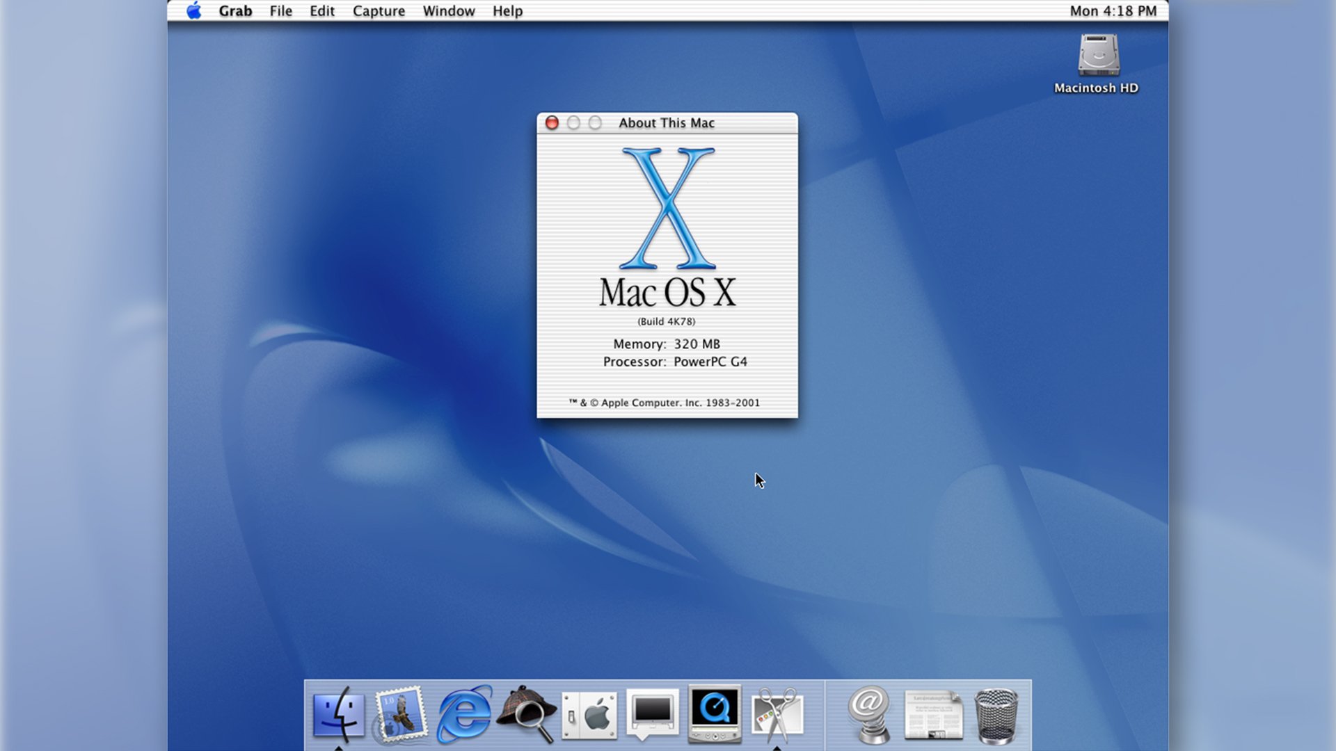
Then: OS X Cheetah
Image: Used with kind permission of 512 Pixels.
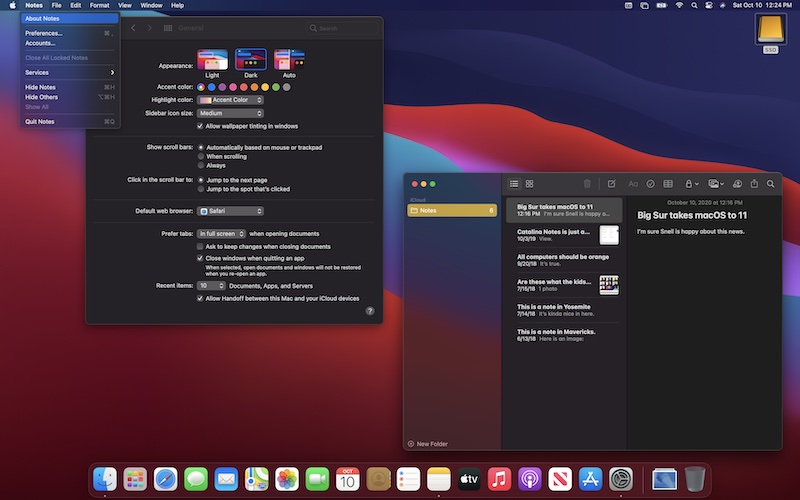
Now: macOS 11 Big Sur.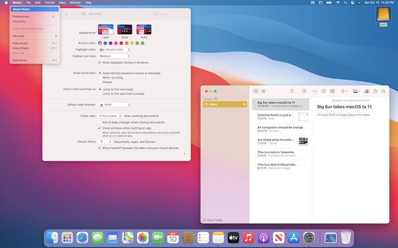
Image: Used with kind permission of 512 Pixels.
Until 2007 I had always been a Windows user myself, moving from an Atari Falcon - a computer that used GEM, an OS that bore more than a little resemblance to the classic Mac OS - to PCs in the early/mid 90s, and I always built my own editing workstations. But I had always hated many aspects of the Windows system, not least things like the Registry, which seemed to go wrong all the time, or the fact that apps had to be installed and de-installed rather than simply being dragged to the trash. I even disliked the font rendering. While the Mac had nice smooth fonts that looked like they were printed in a magazine, Windows fonts at the time were jagged and rough with no effective anti-aliasing, despite what the system settings said! I also disliked the way that no matter how many graphical improvements were made to the system, there were always UI inconsistencies such as error boxes from what looked like Windows 95 popping up, or tiny unreadable icons to indicate than an external storage card was connected. Those dated mid-90s dialogue boxes and icons still pop up to this day even on the latest Windows versions.
I also disliked the fact that Windows was pretty much a layer built upon DOS. Even when Microsoft claimed to leave this reliance on DOS behind with Windows Vista, somehow DOS mysteriously seemed to lurk there in the background! What’s more, Windows was not a system that my mum, who had my father with advanced Parkinson’s to deal with, could use easily. She simply could not get her head around it, try as we might. Meanwhile with his Parkinson's my dad could not deal very easily with the need for hovering and then mouse movement on the "My Computer" icon to access various apps and functions.
After I moved to my first Mac, which was the original Intel Mac Pro tower, I eventually moved my parents over to a white MacBook laptop. Using various easy to set up accessibility settings and “Simple” mode meant that finally, in her 70s, my mum was able to use a computer on a day-to-day basis for the first time in her life. She could finally start up a computer, send an email and do her weekly online shop without needing to ask me constantly how to do it. Meanwhile my dad could also continue to access email without deleting some important system file he'd somehow managed to find while trying to work out what he'd done wrong!
Today, now in her 80s, my mum uses a MacBook Air, with only a very occasional need to contact me for technical help. This is not something she would be able to do with a Windows interface, even in its current form, with its confusing but 'hip' general layout - from the point of view of an octegenarian.
It’s an important point to make, despite the inevitable protests I am like to receive in the comments about why I am wrong about everything I say. This is not the first time I have come across this, having seen it happen with iOS based tablets and phones as well. Once again speaking from personal experience, my elderly mum was using an Android based phone that was apparently designed for people of her age, yet she was still constantly confused by it, and constantly needing to contact me for help with it. A month ago she switched over to an iPhone 11 and only took a very short time to adapt to it, and now she can’t believe she didn’t move over earlier. It’s easy and intuitive to use and the interface is clear. It's probably helped by the familiarity and similarity in many aspects to her MacBook Air, but that's a good thing.
This is one of the legacies of the original OS X, and an example of how designing a GUI for people, and not computer geeks, works for everyone. Quite often technical nerds will still say the current macOS isn’t as flexible or as powerful as Windows or Linux. However as per usual such arguments are a bit of a straw man because they ignore the strengths of the OS for the purpose of most people’s work and usage in favour of some quite obscure needs for highly technical people.
OS X heralded a new way of thinking that tried to get the operating system out of the way of the user as much as possible, and to make things intuitive and visually interesting. That’s not to say that OS X succeeded at all of this, nor would I ever say that it did everything perfectly or always better than Windows. No operating system is perfect, and neither can it be, simply because of the wide and varied uses that different people use it for. I can say without hesitation that there are many aspects of the latest macOS Big Sur that I think would probably have Steve Jobs turning in his grave.
But what I can say is that OS X not only demonstrated a new approach to what an OS could be on a personal computer, but it was also a large part of Apple’s reinvention of itself. It became as much a part of the brand identity as the iPod and iPhone. Call me a fanboy if you like, such comments are like water off a duck’s back. I’ve tried Windows time and again in its more recent incarnations and I have never once been tempted to go back. In fact I have usually had my decision to move away from it reinforced.
So happy birthday OS X, and please, don’t take my fandom as a slur on which ever choice you make or a personal attack upon your family members. This is supposed to be a happy occasion. Let’s not bicker and argue about who killed who. The best OS for you is the one you like to use. Mine happens to be on the Mac.
Tags: Technology

RedShark 2020 @ All rights reserved.

Comments