2 minute read

 Colour through analogue eyes
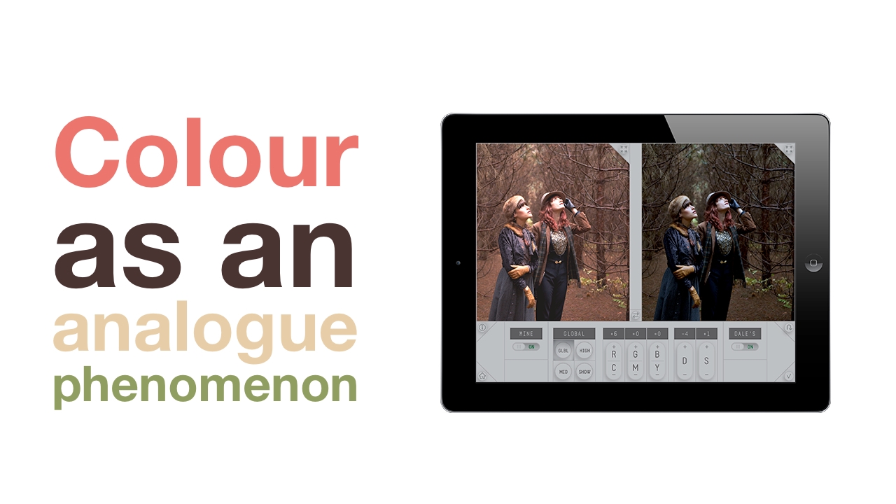
Here's something different: An iPad app that teaches colour correction the way it used to be done with analogue film
Dale Grahn, who is what used to be called a Colour Timer in the days when there was no digital colour processing, has created the colour "look" of some seminal films of the last couple of decades: Saving Private Ryan, Gladiator and Munich. Having Stephen Spielberg on your resume is obviously a good thing.
Dale approached Minneapolis-based Crumplepop, a well-known video plugin developer, to see if they could turn his ideas - based on his lifetime of experience - into an iPad app that aspiring colourists could use to learn the subject in a practical way - without being slaves to the "conventional" digital way of grading.
When we first sat down with Dale Grahn, over lunch, we weren’t sure what to make of his idea.
“All you need is six buttons,” he said. “We can revolutionize the industry.”
It was a bit hard to believe. Color grading was a highly technical, semi-mysterious science. Power windows, HSL keys, tracking masks, eyedroppers, scopes, giant control surfaces in dark suites – our understanding was that you needed power tools to even play the game. A lot more than six buttons.
Nevertheless, it was difficult to discount what Dale was saying. Dale Grahn was a color timer – the film world antecedent to the digital colorist. And he wasn’t just any color timer – he had crafted the look of Saving Private Ryan, Gladiator, Munich, and hundreds of other films. When Apocalypse Now needed to be re-timed for Apocalypse Now Redux, they went to Dale Grahn. When Steven Spielberg needed a color timer, he went to Dale Grahn.
Dale doesn’t immediately slice up the image and start tweaking it. As a color timer, you don’t have those tools. You have to look at the image as a whole, and work with it on its own terms. It’s an absolutely, fundamentally different way to look at an image. Sometimes, that’s a lot more limiting than working with digital tools. Power windows are handy.
But more often, Dale’s approach is liberating. With all the tools and gizmos gone, you have to focus on fundamentals. What does early morning light look like? What does it look like when it’s a cold day, and the subject has a darker skin tone? How does that connect to the feeling of the story at that moment?
Often, the best way to approach these questions is to get back to basics. With, for instance, just six buttons.
“The goal is to learn how to think color,” Dale had said when we first met. It makes sense to us now.
This is just our first collaboration with Dale – we also have some some very exciting tools for film and video editors in the works. For now, we hope you enjoy Dale Grahn Color for iPad. With the app launched, we finally have time to site down with a hot chocolate and try to figure out why, in that one lesson, Dale added those two points of cyan
Tags: Post & VFX

RedShark 2020 @ All rights reserved.
Comments