2 minute read

 La Linea Roja by Nicolas Rivals
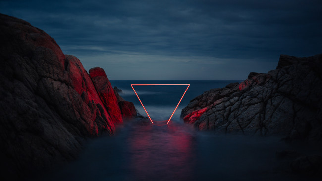
An evaluation of Nicolas Rivals' modern photography series, La Linea Roja, leads to some poignant considerations for filmmakers.
A lot of modern art hovers on the boundaries between triviality and minimalism and this article probably isn't one that'll be enjoyed by people who need art to be complicated. In any case, I'm possibly doing Nicolas Rivals, the artist concerned, a bit of a disservice. It might just be some bits of electroluminescent tape rigged up in some Spanish forests, but the rigging (perhaps given its final polish by Photoshop) is impeccable. The mechanical details aren't really the point, though.
The series of photos, which Rivals calls La Linea Roja ('The Red Line' in Spanish) are an absolute masterclass in the combination of a relatively simple idea and some expert technique to produce an immensely attractive end. The visual simplicity of it leaves the concept and the technique to do practically all the work. To return to those mechanical details, as inevitably we must, Rivals' photos demonstrate a very straightforward and cost-effective route to some very pretty pictures.
The compositions are actually driven more by the terrain than the special visual effect. In each case, the image is of a valley, a stand of trees or a rock formation – and they really are pictures of those things, as opposed to pictures of the red line. The framing is really pretty conventional, even deliberately naive, in the same way any capable photographer would photograph the same scene. The images are all in the 3:2 aspect ratio of conventional stills photography and the subjects are framed with a clear interest in slightly-disturbed symmetry, although it's hard to tell if this is an intent or an unavoidable reality of the location that's been carefully chosen, then happily embraced.
One of the most striking aspects of these images (and one that is fractionally unusual, at least in terms of film colour design) is the use of red and blue. Again, there's a level at which this is fairly off-the-peg, inasmuch as red and blue have well-established colour contrast, but on the big and small screen we're probably more used to brownish-oranges (because that's the colour humans are) leading inevitably to the whole teal and orange thing, which is becoming green and orange almost as I type. The reality is that teal and orange are (roughly) the colours of flesh and sky. Red and blue aren't, really, and it's probably a good thing there are no people in these shots because it's not entirely clear what they'd end up looking like. The loneliness, for what it's worth, is clearly intended.
As to how it was done? Well, it's electroluminescent strip and a very long exposure. Most of the work is in rigging, and creating these precisely straight lines can't have been easy. The visibility of stars makes it clear that these were shot at night, with the blue colour coming from the ambient light and the selected white balance. EL strip really isn't very bright at all and any photograph with an ambition to capture electroluminescent light cast on objects many feet away would need to gather its energies for many, many seconds. If only for that reason, doing something similar with moving images might be tricky.
That didn't stop Tarek Mawad and Friedrich van Schoor, however, who produced Lucid (video and making-of below), which references much the same sort of visual aesthetic. As ever, the choice of location is key, with some truly arresting landscapes used as a holder (much more than a backdrop) to all these pretty glowing abstractions. To be fair, the effect isn't quite as striking as the stills, because the illumination just isn't quite powerful enough, but it's hard to complain too much about something this pretty.
Tags: Production

RedShark 2020 @ All rights reserved.

Comments