4 minute read

RedShark Replay: Understand the basics, know how to calibrate and set white balance - and then you can break all the rules if you want to!
Colour became an obsession of camera people as soon as cameras became capable of recording it and, even now, one of the most common questions asked by student filmmakers is how to achieve certain colour effects – how do we make Eyes Wide Shut orange or Amelie green. There are technical answers to all those questions, but this isn't really a piece about technology. It's about the reasons people do it.
 Charts are there to control the degree to which we get clever.
Because, in some ways, it's madness. We calibrate monitors and shoot charts and select lookup tables to ensure cameras produce a picture somewhat resembling reality (or at least reality as the manufacturer sees fit). But we're not always – or even often – doing that so we can reproduce reality. Reality, at least in the opinion of the entity who watches movies, is boring. We're lining everything up specifically so as to be able to go gleefully, but controllably, off-piste, either in camera or in post. Breaking the rules, as ever, requires knowing them first and, much as we've covered both precision monitor calibration and the reasons why it isn't absolutely always necessary The more crazily we drive, the more important it is that everything's properly lined up. The difference between riding the edge and falling over it is terrifyingly slight.
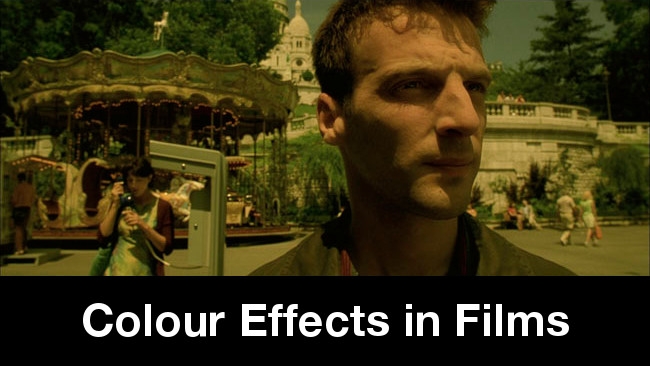
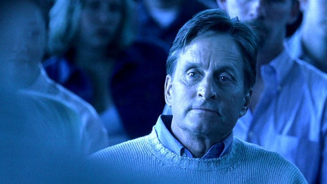
 Ways to make your movie look warm - cast a redhead, and use contrasting blue light. From Eyes Wide Shut. (Image credit: Warner Bros.)
So, if we've decided to chart this risky course, what are the best approaches? It's all too common to find someone standing before a beautiful golden sunset, white-balancing on a sunlit white card. The camera reports a colour temperature that's practically single-digit and the sun looks like a California noon that's slipped a bit. It's the procedure that everyone's taught in camerawork 101, but it isn't always the right way to go. Balance on the shadow side of the card and retain the golden glow. Better yet, dial in manually or balance on something that's illuminated by a mixture of skylight and bounced sunlight (yes, bounce works on the white balance card too) and achieve a halfway house where the sun stays warm and the shadows stay cool, because colour is mainly about contrast. And after all, the biggest movies of the moment are teal and orange, right? Crank up the saturation in post.
 Calibration allows us to establish a baseline, then wander away from it with glee.
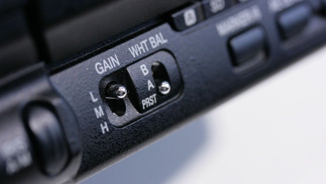
So far, so haphazard. It's difficult to be consistent with white balance, although for years, before the advent of cameras and displays with lookup tables, and even before HD, we made do quite effectively. White-balancing through known lighting gels (orange to make the picture cold, blue to make the picture warm) was a common trick. It works even without post-production, although tricks such as winding up the black level, as was commonplace on the standard-def cameras when shooting for a high-contrast result, helps. On modern cameras shooting raw, white balance is sometimes even alterable in post, though, and things have moved on. When we white balance, we're really creating a lookup table, albeit one over which we have precious little control. As with that black level control, many cameras have at least some control over the picture (even Canon DSLRs have approaches for tweaking the inbuilt picture styles, which are, again, LUT-based). We've talked about LUTs before and there are better, more controllable ways to create them than tweaking controls in the field.
 Two colours blue - Washington, DC scenes in Soderbergh's adventurous Traffic. (Image credit: Universal Pictures)
The thing is, once we get down to the reality of tweaking pictures in colour grading software or throwing filters in a mattebox or onto barn doors, it becomes very clear that this more about taste and matters of opinion than technical reality. As such, politics play a huge part – and one reason that a lot of stuff is shot conservatively is that aiming the camera at a white surface and pressing the button is a highly defensible approach. It may not look spectacular, but it's difficult to argue that it's incompetent. Shoot everything bright yellow and, if someone doesn't like it, you can refer that person to Soderbergh's 2001 Traffic all you like; it isn't what the camera manufacturer designed and it's one opinion against another.
 White balance. Use creatively.
Traffic, though, won four Academy Awards and was nominated for Best Picture. The fact that it didn't win that award is one thing; the fact that it lost to Gladiator is another. It was probably never going to win the award for cinematography, given that Peter Andrews is Soderbergh's pseudonym when he directs photography on his own films. At the independent film level, then, there's every reason to use the freedom, to lean on the controls.
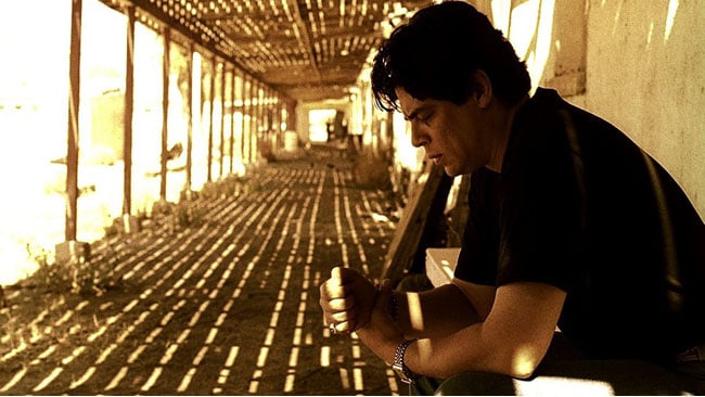 Two colours yellow - south of the border in Traffic. (Image credit: Universal Pictures)
Without question, the most difficult part of any particularly wayward adventures in cinematographic colour is in controlling post, particularly in the case where it might not be entirely advisable – or entirely sane – to go as far as we'd like to in camera, in case, as we've discussed, someone doesn't like it. Modern raw-shooting workflows, with monitors LUTed to show our final intent, work directly against the approach of getting everything we want in camera, which at least makes it more difficult for mistakes to happen later. Nevertheless, it's important to do it, since nontechnical and even nonartistic people can quickly get used to flat, desaturated log images on monitoring and become incredibly resistant even to normality, let alone adventurousness in the grade. Ensuring that the right lookup tables get to the right places is difficult at all levels and even though a lot of people are writing a lot of code to ensure that offline, viewing and editing copies end up looking something like correct, the challenge remains.
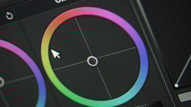 Cheap, easy software for grading means postproduction colour control has never been easier.
Choices made in colour can seem straightforward. Orange and yellow is warm – although Fincher often makes yellow seem sickly. Blue can seem cold and forbidding, although some productions use blue-green shades to indicate the sterile environs of an operating theatre or other medical environment. Music concerts like to highlight the performer with beams of xenon arc light that often read as bluish on camera, although producers (and vain actors) may prefer skin tone to read as warm. What this serves to illustrate is that objectivity has only an associate role to play. Consistency matters; it all needs to look like one movie. Beyond that, though, almost anything can be justified in the right context. Building that context, in which every discipline of filmmaking works cooperatively towards mutually self-supporting ends, is what it's all about. LUT boxes and monitors and cameras and all their capabilities and features are nothing if not in support of that.
Tags: Production

RedShark 2020 @ All rights reserved.

Comments